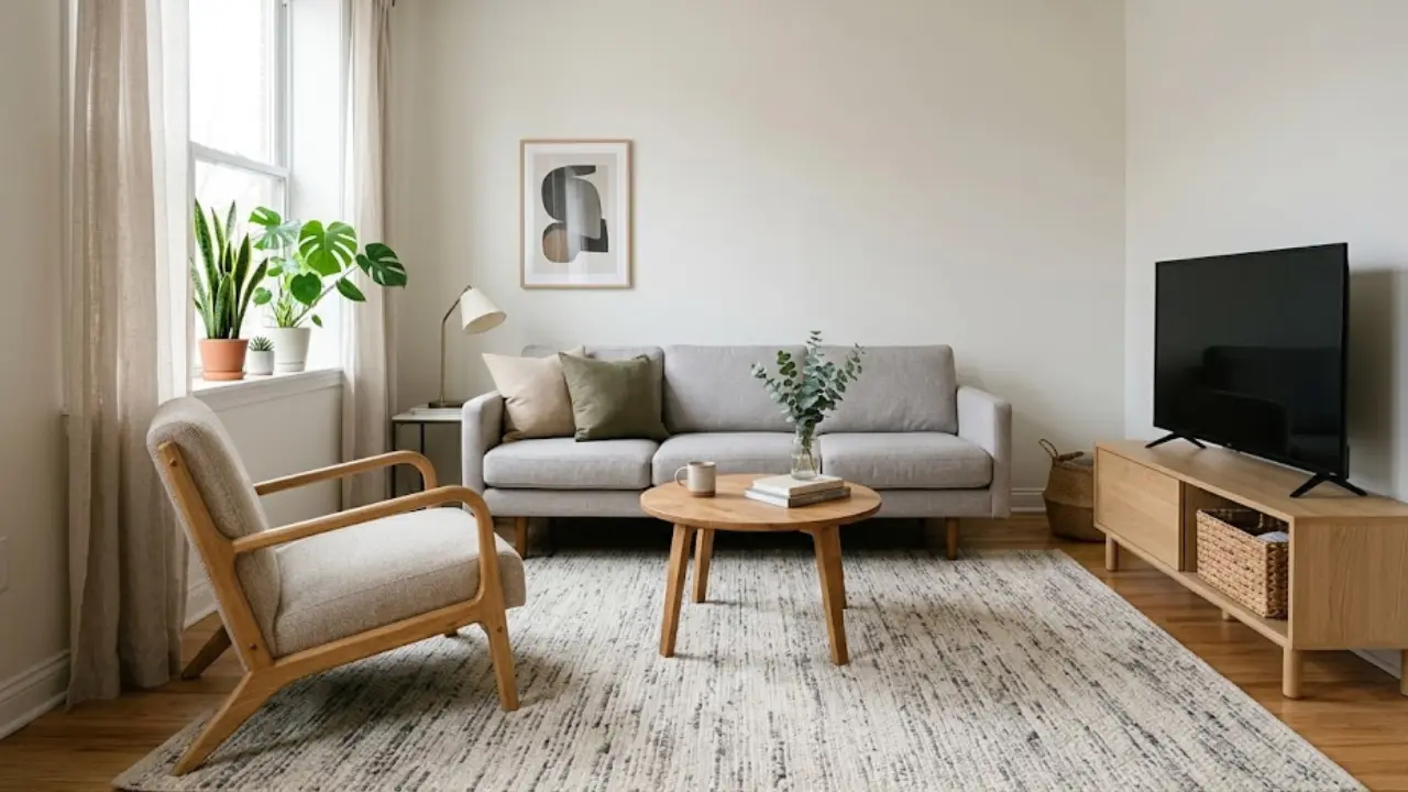
You move into a new apartment, stand in the middle of the living room, and stare at four walls that are — without fail — some shade of off-white. Maybe “Antique White.” Maybe “Linen.” Maybe a color that has no name because no one has ever loved it enough to give it one.
Sound familiar?
Most renters know this feeling intimately. Your landlord hands you a key, points to the lease clause about repainting fees, and suddenly your dream of a cozy, colorful living space feels completely out of reach. But here’s what I’ve learned after renting for years and helping friends transform their own spaces: you have way more options than you think — and none of them involve touching that sad beige wall with a paintbrush.
This guide is specifically for renters who want a living room that actually feels like them — full of personality, color, and warmth — without risking their security deposit. I’ll walk you through the best rental-friendly color strategies, the smartest products, and the design principles that make color work even in spaces you don’t own.
Let’s turn that rental living room into something you’re genuinely excited to come home to. The right living room color ideas for rental apartments can completely transform even the most boring space—without breaking any lease rules.
Why Color Matters More in a Rental (And Why Most Renters Get It Wrong)
Before we get into the how, let’s talk about the why — because understanding this changes the way you approach the whole project.
Color does something powerful in a room. It sets the emotional temperature. It makes a space feel larger or smaller, warmer or cooler, energizing or calming. In a living room especially — where you spend the most time — the color environment has a direct effect on how you feel at home.
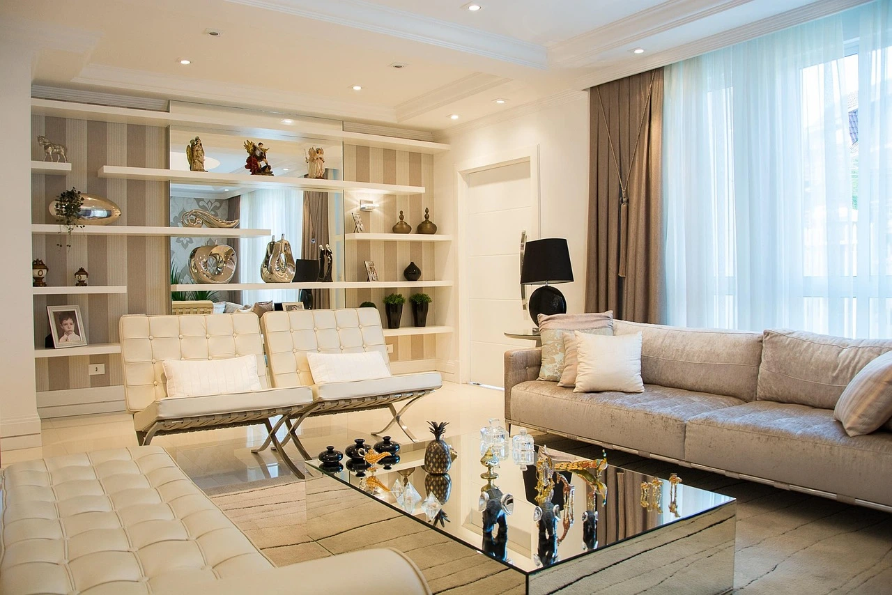
Most renters respond to “no painting” rules by simply giving up on color altogether. They layer neutral on neutral, buy beige furniture because it feels “safe,” and end up with a living room that looks like a hotel room nobody checked into yet. It’s functional. It’s just not alive.
The smarter move is to add color through everything except the walls — and then, where walls are involved, use renter-friendly methods that your landlord will never even notice. The best living room color ideas for rental apartments focus on layering color through elements you can easily change or remove.
The Rental Color Trap to Avoid
Here’s a mistake I see constantly: renters who buy one colorful throw pillow, call it a day, and wonder why the room still feels flat. One accent piece doesn’t transform a space. Color needs to be layered — across textiles, surfaces, statement pieces, and wall treatments — before it starts to actually register as a design choice rather than an afterthought.
Think of it like seasoning food. A pinch of salt does nothing. The right amount, applied in the right places, makes everything come alive. Color works exactly the same way in a room.
The good news? Once you understand how to layer it, you don’t need painted walls at all. Some of the most beautiful rental living rooms I’ve seen use zero paint and still feel completely intentional and full of character.
Step 1: Choose a Color Direction (Before You Buy Anything)
The biggest mistake renters make is shopping without a color direction. They see a pretty rug at Target, a throw pillow they love at HomeGoods, a lamp on Amazon — and suddenly the room has five competing color stories that don’t talk to each other.
Before you spend a single dollar, decide: what feeling do you want your living room to have?
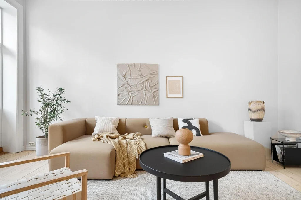
Warm Tones: Terracotta, Rust, Mustard, Warm Cream
Warm color palettes make a living room feel cozy, grounded, and welcoming. Think earthy terracotta, deep rust, golden mustard, and warm creams. These tones work especially well in rooms that get natural light — they glow beautifully in the afternoon — and they’re incredibly forgiving on neutral beige walls, which tend to have warm undertones anyway.
If you want your living room to feel like a hug at the end of a long day, go warm.
Best for: Smaller apartments, east or west-facing rooms, people who want a cozy, lived-in feel.
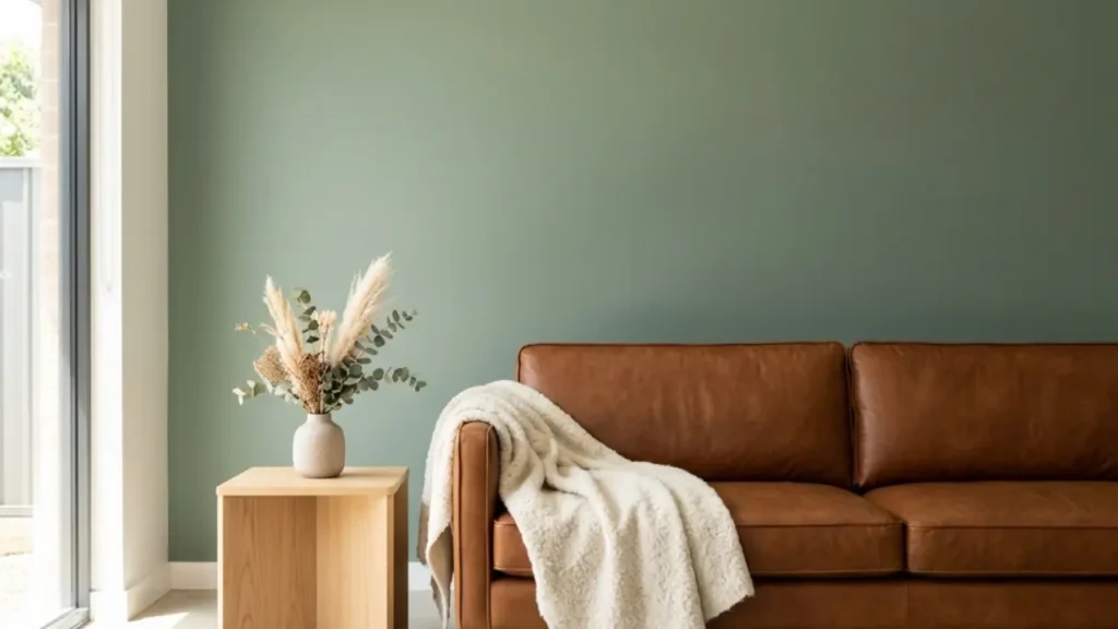
Cool Tones: Sage, Dusty Blue, Soft Teal, Slate
Cool tones make a space feel calm, airy, and slightly more sophisticated. Sage green has been one of the most popular living room colors for renters over the last few years, and honestly — it deserves the attention. It works with almost every neutral, it photographs beautifully, and it gives a room an effortless “put-together” quality that’s hard to achieve with bolder colors.
Dusty blues and soft teals are equally versatile and bring a quiet, retreating quality to a room — perfect if your living room doubles as a work or study space.
Best for: Larger rooms, north-facing rooms with cooler light, people who want a calm, intentional aesthetic.
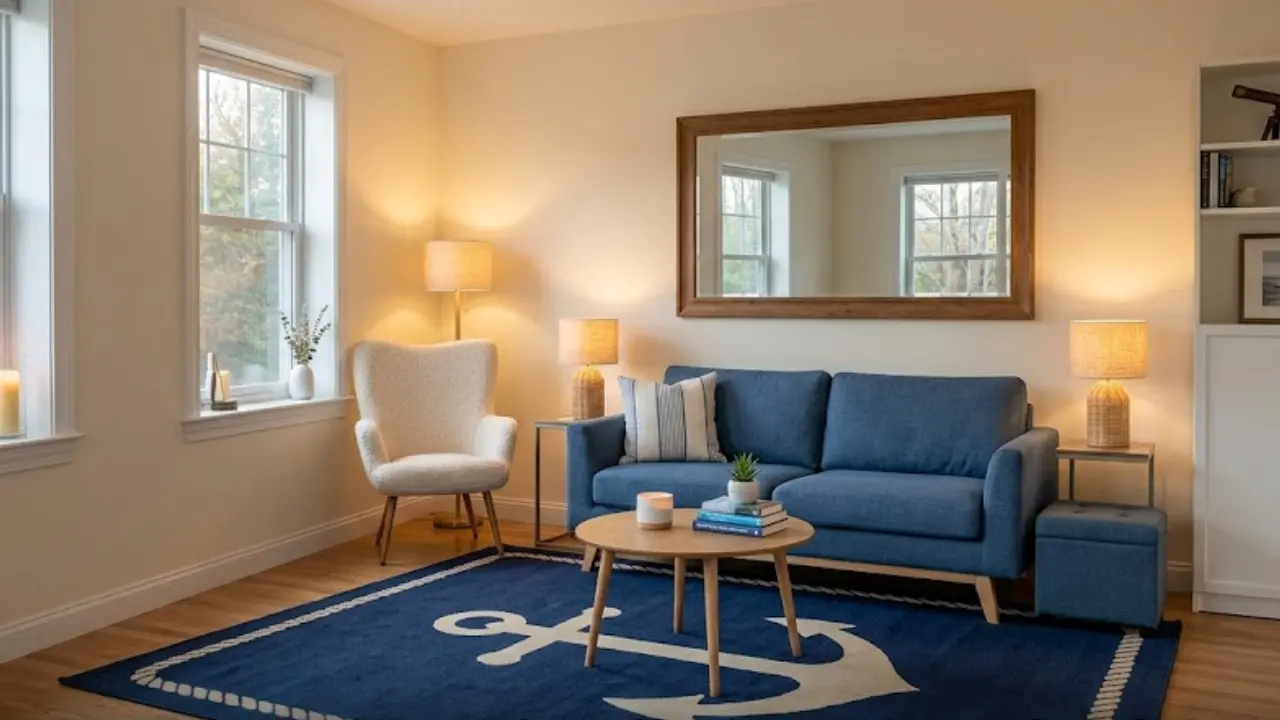
Bold Accents: Emerald, Navy, Deep Berry, Burnt Orange
If neutrals feel too safe and pastels feel too soft, bold accent colors are your answer. The key with bold is restraint — you don’t use them everywhere. You pick one or two places where they’ll have maximum visual impact (a large rug, a statement chair, a wallpaper panel) and let everything else breathe.
Best for: Renters who want personality and drama without overwhelming the space.
Step 2: The Renter’s Secret Weapon — Peel-and-Stick Wallpaper
If there’s one product that has genuinely changed the rental decorating game in the last decade, it’s removable peel-and-stick wallpaper. And I cannot overstate how much of a difference a single wallpapered wall can make.
Here’s how it works: you apply it directly to a clean, dry wall, smooth it out, and it adheres without damaging the paint underneath. When you move out, you peel it off — and the wall underneath looks exactly as you left it. No damage, no residue, no security deposit drama.
One excellent option I’d recommend for this is this peel-and-stick wallpaper — it comes in a range of patterns and colorways, has strong reviews from renters specifically, and goes up much easier than you’d expect for a first-timer.
👉 Check it out on Amazon (affiliate link — I may earn a small commission at no extra cost to you)
How to Use Wallpaper as a Color Strategy
The most effective way to use peel-and-stick wallpaper in a rental living room is as an accent wall — typically the wall behind your sofa or the one your TV faces. You’re not papering the whole room. You’re creating one deliberate focal point that anchors the entire color scheme.
Choose a wallpaper with a color or pattern that becomes the base of your palette. If you choose a warm terracotta floral, your pillows, rug, and accessories should pull from those same tones. If you choose a graphic navy and cream pattern, your accents should respond to it.
A few pro tips:
- Measure carefully before ordering — most wallpaper is sold in panels or rolls, and you need to account for pattern repeat
- Start from the center of the wall outward so the pattern is balanced
- Don’t rush the application — smooth slowly and check for bubbles as you go
- Clean the wall first with a damp cloth and let it dry completely — this is the single biggest factor in how well it adheres and releases
If a full accent wall feels like too much, try a half-wall treatment (wallpaper from the floor to chair rail height) or a geometric panel centered behind your sofa. Both look intentional and are even easier to apply and remove.
You can read more about renter-friendly ways to personalize your space in our guide on how to make a rental apartment feel like home.
Step 3: Layer Color Through Textiles (This Is Where Most of the Magic Happens)
Paint gets all the credit, but honestly? Textiles do more for a room’s color story than almost anything else — and they’re entirely renter-friendly because they move with you.
In a living room, your main textile opportunities are:
- Throw pillows (the fastest, cheapest color update in decorating)
- Throws and blankets draped over sofas or chairs
- Curtains (often underestimated — they cover a huge amount of vertical space)
- Area rugs (the single most impactful textile in a living room)
Throw Pillows: The Fastest Color Upgrade You Can Make
I want to spend a moment on throw pillows because people underestimate them. A set of well-chosen throw pillows on a sofa can completely change the color reading of a living room. And unlike furniture or wallpaper, you can swap them seasonally without committing to anything.
The rule I always use: choose pillows in 2-3 colors from your chosen palette, in varying sizes and textures. Don’t match everything exactly — that reads as stiff. Mix a solid with a pattern. Mix a velvet with a linen. Mix a 20″ with an 18″ and a 16″. The variety is what makes it look styled rather than showroom-ready.
These decorative throw pillow covers are a great option — they’re affordable, come in a wide range of colors, and since they’re covers (not filled pillows), you can switch them out easily as your style evolves.
👉 See the options on Amazon (affiliate link — I may earn a small commission at no extra cost to you)
Curtains: The Most Underused Color Tool in Rental Decorating
Most renters either skip curtains entirely (relying on whatever blinds came with the apartment) or buy the cheapest white panels they can find. Both are missed opportunities.
Curtains cover a significant portion of your wall space — sometimes 6 to 8 feet of vertical height. That’s a lot of color real estate going unused.
Here’s what I’d suggest: if your color palette is neutral and soft, use curtains as your one bold color moment. A set of deep sage, dusty blue, or warm terracotta curtains against a beige wall creates an instant color anchor without any permanent changes.
If your palette is already colorful (bold wallpaper, vibrant rug), go the opposite direction — simple white or cream linen curtains that let everything else breathe.
Curtain hanging tip for renters: Use Command hooks or tension rods if your landlord doesn’t allow wall drilling. Tension rods have improved dramatically in quality over the last few years and can hold curtain panels of reasonable weight without sagging.
Step 4: The Rug Is Doing More Work Than You Realize
An area rug is the single most impactful design element in a living room — and I say that as someone who spent years placing rugs wrong and couldn’t figure out why rooms felt off.
Here’s what most people don’t know: the rug isn’t just a color element. It’s the visual anchor of the entire room. The furniture arrangement, the proportions, the flow — all of it responds to where the rug sits and how big it is.
Getting the Size Right (This Is Critical)
The most common rug mistake in rental apartments? Going too small. A rug that’s too small for the room makes everything look like it’s floating — disconnected and slightly chaotic. The general rule for living rooms:
- At minimum: all four legs of the sofa on the rug
- Ideally: all furniture legs on the rug with 12-18 inches of bare floor showing around the edges
- Most common mistake: an 8×10 in a room that needs a 9×12
When in doubt, go bigger. A larger rug that fills the space properly will always look more intentional than a smaller one that leaves furniture stranded.
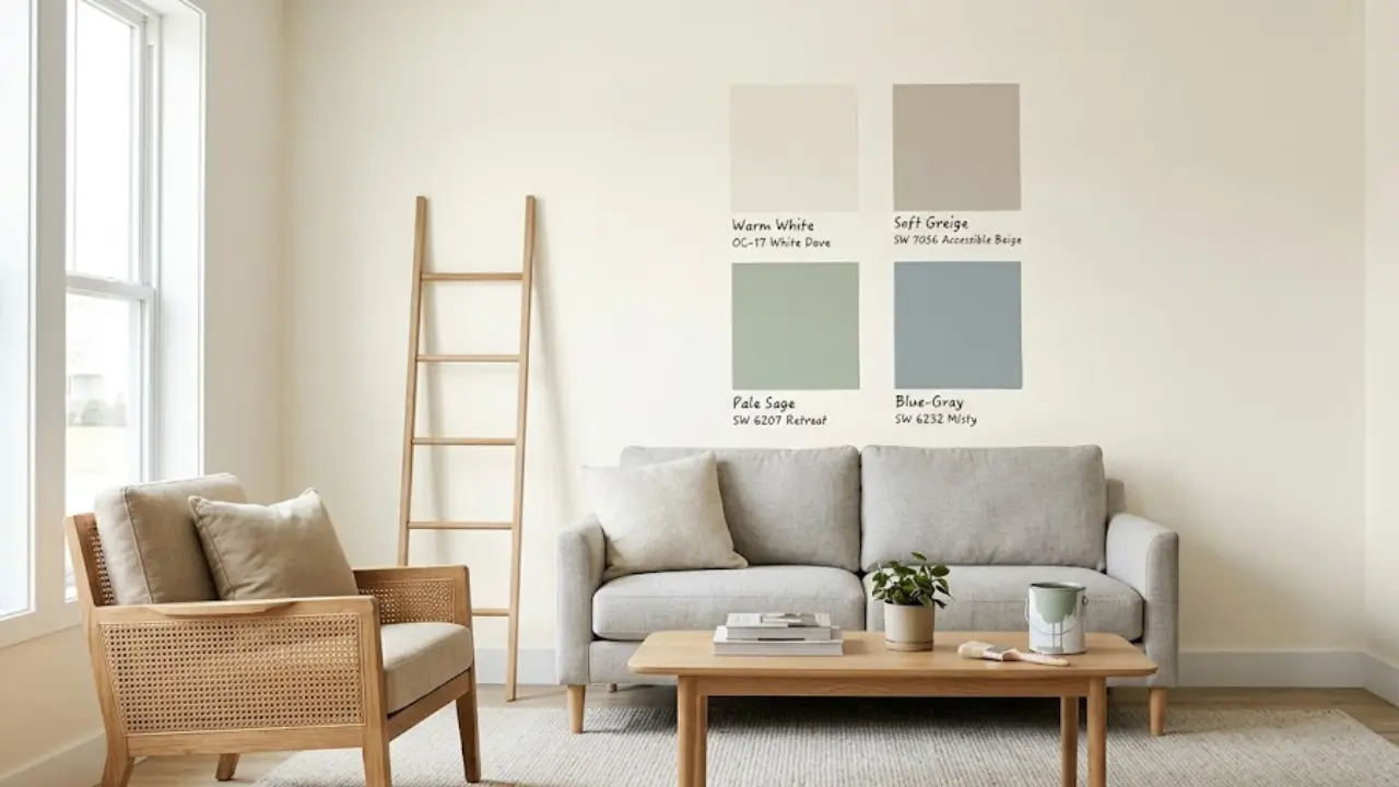
Choosing Rug Colors That Work With Rental Walls
Since rental walls are almost always warm-toned neutrals (off-white, cream, greige), you have a lot of flexibility with rug color. Here’s what works consistently:
Warm-toned rugs (terracotta, rust, camel): These blend beautifully with warm walls and create a cozy, cohesive feeling. They’re also very forgiving — small stains and wear are much less visible in these tones.
Cool-toned rugs (sage, dusty blue, grey-blue): These create a contrast against warm walls that feels sophisticated and intentional. The contrast is what makes the room feel designed rather than accidental.
Patterned rugs (vintage Persian, Moroccan, abstract): These are the wild card — and often the best choice for renters who want personality without committing to a single solid color. A well-chosen patterned rug essentially becomes your color palette and tells you what else to buy.
For more help with rug color choices, our guide on what color rug goes with a grey couch has detailed color pairings that apply to almost any neutral sofa.
Step 5: Color Through Furniture and Décor Accents
Once your textiles and wall treatments are sorted, the final layer of color comes from furniture and smaller décor accents. This is where the room goes from “styled” to “finished.”
Statement Furniture Pieces
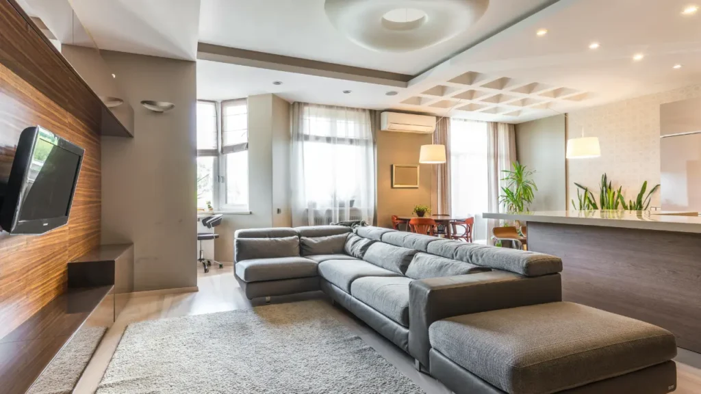
If your sofa is neutral (beige, grey, cream, or the oh-so-classic grey sectional that lives in half of all rental apartments), you have the opportunity to add a statement chair or side chair in a color that anchors the accent palette.
An emerald green velvet chair. A mustard yellow armchair. A deep navy accent chair. One bold furniture piece, surrounded by more neutral elements, carries enormous visual weight without overwhelming the room.
If you’re renting furnished (or simply can’t afford new seating), this is where throw covers, slipcovers, or large throws draped artfully come in. A chunky cream knit throw over a grey sofa immediately softens and warms it.
Bookshelves and Open Shelving as Color Opportunities
If your rental has built-in shelving — or if you’ve added a freestanding bookcase — don’t underestimate it as a color opportunity. Styling shelves with a controlled color palette (grouping books by spine color, adding objects in your chosen palette, using the back of the shelf as a color backdrop) creates a cohesive, intentional look.
A simple trick: paint the back panel of a freestanding bookcase with a sample pot of your chosen color. Sample pots cost a few dollars and cover a small area — and since you’re painting the inside of a piece of furniture (not a wall), it’s entirely within your rights as a renter.
Plants: The Color Element That Breathes
I’d be remiss not to mention plants as a color strategy. Greenery adds a dimension that no paint or textile can replicate — it introduces organic color, texture, and movement into a room. And for renters especially, plants solve the “something’s missing” feeling more reliably than almost anything else.
A tall fiddle leaf fig in a corner. A trailing pothos on a shelf. A cluster of small succulents on a windowsill. The green of living plants interacts with every other color in the room and pulls the palette together in a way that feels completely natural.
Check out our full decorating guide on living room with a brown sofa for more ideas on how plants and natural textures work as part of a warm, earthy color scheme.
Step 6: Color Palettes That Work Specifically in Rental Apartments
Let me give you some concrete palette combinations you can use as starting points. These are specifically chosen to work against warm neutral walls (the default in most rentals):
Palette 1: Warm Earthy (Terracotta + Warm Cream + Rust)
- Wallpaper accent: Terracotta floral or geometric peel-and-stick
- Rug: Warm rust or vintage-style Persian in amber tones
- Pillows: Mix of rust solid, cream linen, and a small terracotta pattern
- Curtains: Warm cream or natural linen
- Accent pieces: Wooden candleholders, wicker baskets, terracotta pots
- Feels like: A warm, sun-soaked afternoon in a thoughtfully curated space
Palette 2: Cool Calm (Sage + White + Warm Wood)
- Wallpaper accent: Sage green botanical or simple sage solid panel
- Rug: Neutral ivory or light grey with subtle texture
- Pillows: Sage, white, and one warm cognac or camel for contrast
- Curtains: Crisp white linen panels (floor-to-ceiling)
- Accent pieces: Light wood tones, brass hardware, simple ceramic vases
- Feels like: A Scandinavian-inspired retreat — calm, airy, and effortlessly clean
Palette 3: Bold Contrast (Navy + Cream + Warm Brass)
- Wallpaper accent: Navy and cream geometric or classic navy stripe
- Rug: Cream or ivory with a subtle pattern — let the wallpaper be the star
- Pillows: Navy, cream, and a pop of soft gold or mustard
- Curtains: Cream or off-white — don’t compete with the wallpaper
- Accent pieces: Brass table lamps, gold-frame mirrors, deep blue ceramic accents
- Feels like: A sophisticated, intentional space that photographs beautifully
Palette 4: Soft Romantic (Dusty Rose + Cream + Warm Neutral)
- Wallpaper accent: Soft floral or subtle blush wallpaper panel
- Rug: Cream or pale beige — keep it soft
- Pillows: Blush, ivory, and dusty mauve — all in the same tonal family
- Curtains: Blush linen or sheer white with subtle warmth
- Accent pieces: Gold-toned accents, dried pampas grass, vintage-style mirrors
- Feels like: Soft, feminine, and completely Instagram-worthy
Expert Tips: What Interior Designers Do That Renters Don’t
After following interior design accounts, reading extensively, and trying things in my own rental spaces over the years, here are the professional-level insights that most decorating guides skip:
1. The 60-30-10 Rule This is the golden ratio of color decorating. 60% of your living room should be your dominant color (usually walls, large furniture, rug). 30% should be your secondary color (curtains, sofa throw, accent chair). 10% should be your accent color (pillows, small decor, plants). If a room feels “off” and you can’t figure out why, it’s often because this ratio is out of balance.
2. Undertones Matter More Than the Color Itself Off-white walls are not neutral — they have undertones. Most rental apartment walls lean warm (yellow or pink undertones). This means cool colors like pure grey or true white can look slightly “off” against them. Before you commit to a color palette, hold swatches against your actual wall in different lights and see how they interact.
3. Light Changes Everything — Sample Before Committing A sage green rug that looks perfect in a well-lit shop can look muddy and dark in a north-facing apartment with limited natural light. Always order samples of rugs and wallpaper when possible, and always assess them at different times of day in your actual space.
4. Cohesion Beats Coordination Your living room doesn’t need to be perfectly “matchy.” In fact, matching everything exactly tends to look stiff and unnatural. What it does need is cohesion — a sense that all the choices came from the same intention. Mix patterns, mix textures, mix light and dark — but keep them in the same color family and it will feel effortlessly put-together.
5. Don’t Forget the Ceiling Most renters never look up. The ceiling is the one surface you can almost always paint without landlord issues (check your lease) — and a soft color wash on the ceiling can completely change the atmosphere of a room. Even just painting the ceiling the same color as your walls (rather than leaving it builder-white) creates a cocoon effect that feels infinitely cozier.
Common Mistakes That Flatten a Rental Living Room (And How to Fix Them)
Mistake 1: Sticking to all neutrals because it feels “safe” Safe equals forgettable. Neutrals are the base, not the whole story. Add at least one genuinely colorful element — a bold rug, a wallpaper panel, a statement chair — and the room immediately gains the personality it’s missing.
Mistake 2: Buying too small Undersized rugs, undersized curtains hung too high, undersized pillows on a large sofa. Scale is everything in a living room. When in doubt, go up a size.
Mistake 3: No color on the walls at all Even renters who “can’t paint” have options — peel-and-stick wallpaper, removable wall panels, large-format art, and hanging textiles all introduce wall color without touching the surface beneath. Don’t skip this layer entirely.
Mistake 4: Ignoring lighting as a color element The color of your light bulbs dramatically affects how your chosen palette reads. Warm bulbs (2700K) bring out the warmth in terracotta and cream palettes. Cooler bulbs (3000-3500K) work better with sage, grey-blue, and crisp white schemes. Mismatched bulb temperatures in the same room create visual dissonance that’s hard to pinpoint but easy to feel.
Mistake 5: Treating every surface equally Not every surface needs equal color weight. Decide early which element will be your focal point (the wallpaper wall, the rug, the sofa) and let everything else support it rather than compete with it.
Now let’s look at some practical living room color ideas for rental apartments you can apply right away.
Your Rental Living Room Color Plan: A Simple Action Steps
Ready to put this into practice? Here’s how to approach it:
- Pick a palette direction first — warm, cool, or bold accent
- Choose one “hero” element — wallpaper panel, area rug, or statement furniture piece — that sets the palette
- Pull 2-3 supporting colors from your hero element and repeat them in textiles (pillows, throws, curtains)
- Add plants for organic color and texture
- Layer lighting — swap bulbs to match your palette’s temperature
- Add small accents last — vases, candles, books, artwork — once the big pieces are in place
You don’t have to do everything at once. Start with the hero element, get it right, and build from there. A well-chosen rug or a single wallpapered wall is enough to completely transform the feeling of the room while you figure out the rest.
These living room color ideas for rental apartments prove that you don’t need paint to create a space that feels personal.
FAQs: Living Room Color Ideas for Rental Apartments
How can I add color to a rental apartment without painting the walls?
You can introduce vibrant colors using peel-and-stick wallpaper, large-format wall art, and floor-to-ceiling curtains. These options allow you to personalize your vertical space without violating your lease or losing your security deposit.
Does peel-and-stick wallpaper actually come off without damaging the paint?
Yes, most high-quality removable wallpapers are designed to peel off cleanly. To ensure a damage-free removal, apply it to a clean, smooth surface and avoid using it on walls with already peeling or poor-quality paint. It’s always best to do a small “patch test” in a corner first.
What are the best living room color ideas for rental apartments with beige walls?
Since most rentals have warm-toned beige or off-white walls, colors like Sage Green, Terracotta, and Dusty Blue work best. These shades complement neutral undertones while adding a modern, intentional feel to the living space.
Can a rug change the color dynamic of a living room?
Absolutely. An area rug is the largest color block in the room after the walls. A bold or patterned rug can serve as your “color anchor,” allowing you to pull accent colors for your pillows and decor, effectively shifting the room’s focus away from the neutral walls.
How do I choose the right accent colors for a small rental living room?
Use the 60-30-10 rule: 60% neutral (walls/large furniture), 30% secondary color (rugs/curtains), and 10% bold accent (pillows/art). In small spaces, stick to cooler accents like soft blues or greens to make the room feel more open and airy.
The Bottom Line: Your Rental Living Room Can Be Beautiful
A lease clause about painting is not a design sentence. It just means you have to be a little more creative — and in my experience, some of the most beautiful, personal living rooms I’ve ever seen have been in rentals, because the people who live in them learned to work with what they had and found solutions that were actually more thoughtful than just slapping paint on a wall.
Color is available to you — through wallpaper, textiles, furniture, plants, lighting, and art. All of it can move with you when your lease ends. All of it can be layered gradually as your budget allows.
Pick a direction. Start with one thing. Let the rest follow.
Your landlord keeps the walls. You get to keep everything else — and that’s more than enough to create a living room you’ll genuinely love coming home to.
Disclosure: This post contains affiliate links. If you purchase through these links, I may earn a small commission at no additional cost to you. I only recommend products I genuinely believe in.


3 Comments
[…] curtains, and rugs will all interact with whatever wall color is already there. The guide on living room color ideas for rental apartments covers how to work with white or off-white rental walls to still get a space that feels intentional […]
[…] dealing with the challenge of renting and not being able to paint, you’ll want to read about living room color ideas that don’t require paint — because several of these transformations apply directly to that […]
[…] also dealing with a living room that feels flat or lacks personality, the ideas in this piece on living room color ideas for rental apartments translate surprisingly well to bedroom spaces too, especially the section on building warmth […]