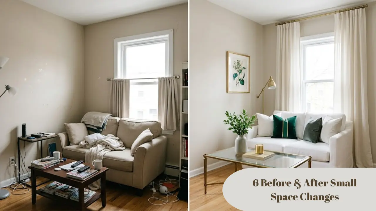
Before and after small space changes are the clearest proof that a room doesn’t need more square footage — it needs better decisions. I’ve made those decisions wrong more times than I care to count, in apartments ranging from 280 square feet to a surprisingly cramped two-bedroom that somehow felt smaller than the studio before it.
You clean the room. You organize it. You try not to let things pile up. And it still feels off — like the room is working against you instead of with you.
That’s what this post solves. Not a fantasy renovation. Not a budget that requires a year-end bonus. Six specific, real before and after small space changes — what the room looked like before, what changed, and exactly why it worked.
These aren’t “add a plant and call it done” tips. If you’re in a small apartment, a rented bedroom, or a studio that’s starting to feel like it’s shrinking by the day, keep reading.
Why Most Before and After Small Space Changes Miss the Real Problem
Before we get into the transformations, it’s worth being honest about why so much small-space content falls flat — even when it looks impressive in photos.
Most advice focuses on adding things — a mirror here, a floating shelf there, maybe a clever storage ottoman. And while those things aren’t wrong, they miss the real issue: in a small space, it’s usually not what you’re missing that makes it feel cramped. It’s what you’re doing wrong with what you already have.
I’ve seen tiny apartments that felt enormous and large rooms that felt suffocating. The difference was almost never square footage. It was clarity, proportion, and light — three things that cost almost nothing to fix once you know what to look for.
According to the American Society of Interior Designers, the most common small-space mistake isn’t lack of storage — it’s poor furniture scale and placement. The fixes are rarely expensive. They’re just invisible until someone shows you exactly where to look.
The before and after small space changes below each target one of these root causes. Some are purely about rearranging. Some involve a specific purchase. All of them made a measurable, visible difference — the kind you notice the moment you walk through the door.
If you’re also dealing with the challenge of renting and not being able to paint, you’ll want to read about living room color ideas that don’t require paint — because several of these transformations apply directly to that situation.
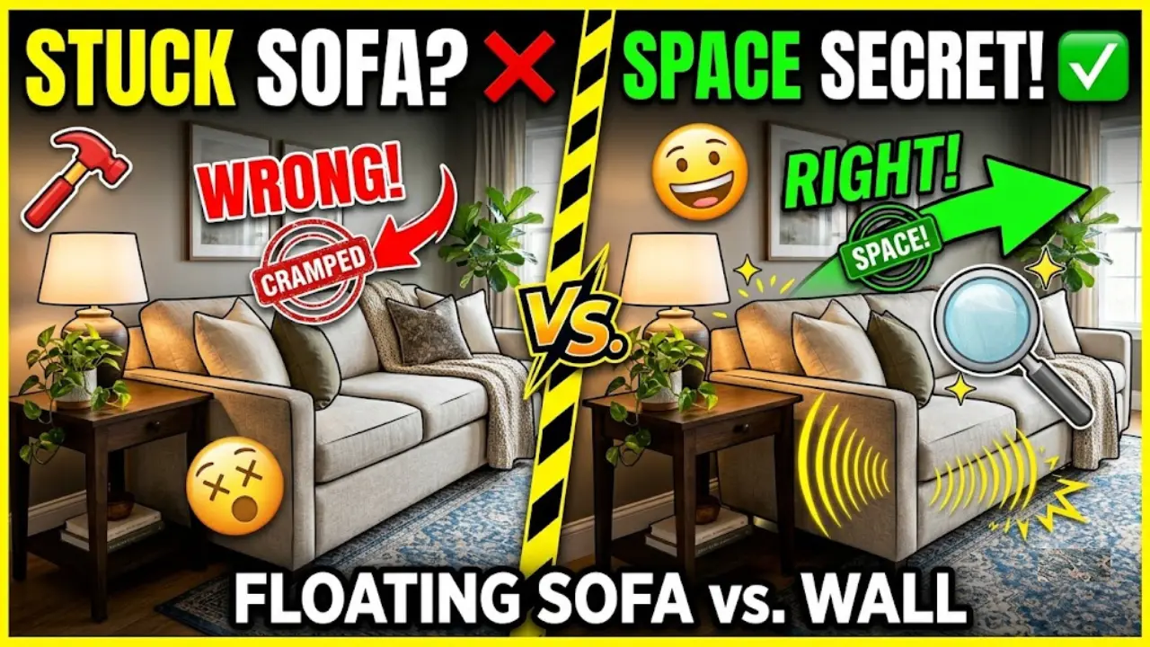
Before and After Small Space Change #1: The Furniture Float
Before: Every piece of furniture was pushed flush against the wall. The sofa hugged one wall. The bed frame was wedged into the corner. The desk was shoved against the third wall. Classic small-space instinct — get everything out of the way to “open up” the center of the room.
After: The sofa was pulled eight inches from the wall. The bed was centered on its wall with equal space on both sides. A rug was placed under the front legs of both the sofa and the chair, anchoring the seating area into a defined zone.
Why it worked:
This one surprises people every time. Pulling furniture away from the walls sounds like the opposite of what you should do in a small room. You’d think it would make the space feel more cramped, not less.
But here’s what actually happens: when everything clings to the perimeter, the center of the room becomes this awkward void — too big to feel intentional, too empty to feel cozy. The furniture doesn’t relate to each other. The room reads as a collection of objects around a blank floor rather than a space.
When you float the furniture even slightly — just six to ten inches from the wall — a few things happen. First, you create a visible gap between the back of the sofa and the wall. That gap reads as depth, which tricks the eye into perceiving more space. Second, the furniture starts to relate to itself, forming a zone. Third, the rug can now anchor the grouping properly.
Interior designers call this “conversation grouping.” The furniture faces each other, not the room’s perimeter. It’s a completely different psychological experience — and one of the most dramatic before and after small space changes you can make for free.
The honest caveat: This works best in rooms that are at least 10 by 12 feet. In a true micro-studio under 200 sq ft, you may only have room to float one piece. Start with the sofa — that’s the highest-impact move.
Cost of this change: $0. Pure rearrangement.
Before and After Small Space Change #2: Swapping a Solid Piece for a Transparent One
Before: A large, solid dark wood TV console dominated one wall of a small living room. Below it, two closed cabinet doors. The unit was practical — it held everything — but it was heavy. It sat in the room like a statement nobody asked for.
After: The solid console was replaced with a slim acrylic and metal media stand with open shelving. The TV appeared to float. The floor underneath was visible. The wall behind showed through.
Why it worked:
Solid furniture in a small room acts like a visual anchor — and not in the good way. Dark, opaque pieces communicate mass. Even when they’re not large by absolute measurement, they read as heavy, and heavy equals more. The eye processes the room as full.
Transparent or open furniture — acrylic consoles, lucite side tables, glass coffee tables, open-frame shelving — does the opposite. It lets light and sightlines pass through. The floor continues uninterrupted. The wall behind stays visible.
This is one of the principles that interior designers use most consistently in small spaces, and one of the most underutilized by homeowners. You don’t need to replace every piece of furniture. One transparent substitute in the right spot can change the entire visual weight of the room.
The best candidates: coffee tables, side tables, media consoles, and nightstands. These sit closest to eye level when you’re seated, which makes them the most visually present — and therefore the highest-impact items to lighten.
For renters whose bedroom furniture is making the room feel boxed in, this pairs well with the approach in the guide to decorating a bedroom with white walls — specifically the section on keeping visual lines clear.
Cost of this change: $80–$250 for a mid-range acrylic or open-frame media stand. Glass coffee tables can be found secondhand for under $60.
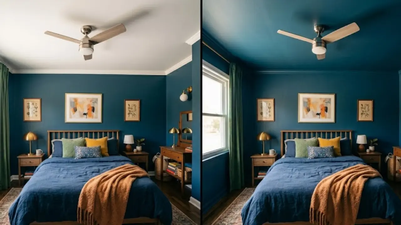
Before and After Small Space Change #3: The Curtain Height Trick
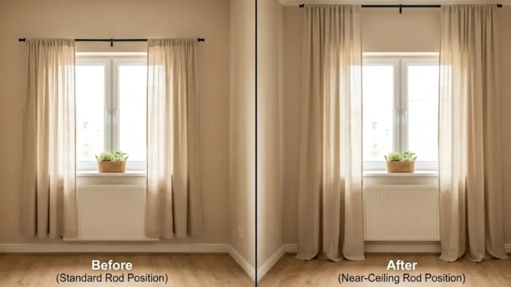
Before: Standard curtains hung from a rod mounted just above the window frame. The panels were the same width as the window. They looked fine. Perfectly appropriate. Completely invisible in terms of impact.
After: The rod was moved up — mounted just below the ceiling, about four inches from it. New curtain panels were ordered long enough to puddle slightly on the floor. The rod was extended 12 inches beyond the window frame on each side.
Why it worked:
This is one of the most well-documented visual tricks in interior design, and I keep coming back to it because it works every single time.
When curtains hang from ceiling to floor, your eye traces a vertical line from the top of the room all the way down. That uninterrupted vertical registers as height. The ceiling feels higher. The window feels larger. The room feels taller.
The width extension works the same way horizontally: when the rod extends past the window frame, the curtain panels cover plain wall when open. When closed, the window looks nearly twice its actual size.
Among all the before and after small space changes in this list, this one consistently produces the most dramatic visual difference relative to its cost. A room with ceiling-height curtains looks finished and considered. The same room with standard-mount curtains looks like nobody made a decision.
According to Architectural Digest’s small space design guides, hanging curtains high and wide is one of the top three interventions designers use to make a room feel larger — and it’s one of the few that renters can execute without damaging walls if they use the right hardware.
A note on fabric: Linen and cotton in light, neutral tones work best in small spaces — they let light through even when closed. Heavy velvet or blackout curtains can make a small room feel like a cave. Save those for bedrooms where blackout is actually needed.
Cost of this change: $40–$80 for curtain panels. A rod extension: $15–$25.
Before and After Small Space Change #4: Eliminating Invisible Clutter
Before: The room was tidy. No piles of laundry. No dishes left out. But every surface had something on it. The windowsill had three plants, a candle, and a bookmark. The coffee table tray had four items plus two remotes and a coaster stack. The side table had a lamp, phone charger, book, and a small succulent.
After: The windowsill kept one plant. The coffee table tray held two items maximum — remotes went in a drawer. The side table kept the lamp and one rotating item (currently a book). Everything else was put away, donated, or relocated to a less visible spot.
Why it worked:
There’s a category of clutter that most decluttering guides ignore: decorative clutter. These are items that are individually intentional — someone chose each one — but collectively create visual noise that reads as chaos.
A small space can handle roughly 60–70% of the decorative load a larger room can. Every surface object competes for attention. In a big room, a busy windowsill barely registers. In a 300-square-foot studio, it’s one of seven things your eye lands on every time it scans the room.
The rule I follow — and it came from a lot of trial and error — is one anchor, one accent per surface. A lamp is the anchor. The book next to it is the accent. Done. Adding a third item, even a beautiful one, tips the surface from styled to cluttered.
This is especially critical in small spaces because every surface is visible from almost every other point in the room. There’s nowhere to hide the accumulation.
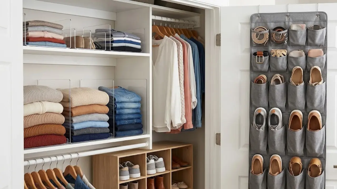
The psychological effect of clearing surfaces — even just reducing items by half — is almost instant. The room feels like it has more oxygen. This directly connects to the storage challenge: if you’re struggling with where to put things in a small bedroom, the system in small bedroom storage ideas will help you keep surfaces clear permanently rather than temporarily.
Cost of this change: $0. This is a subtraction.
Before and After Small Space Change #5: Strategic Mirror Placement
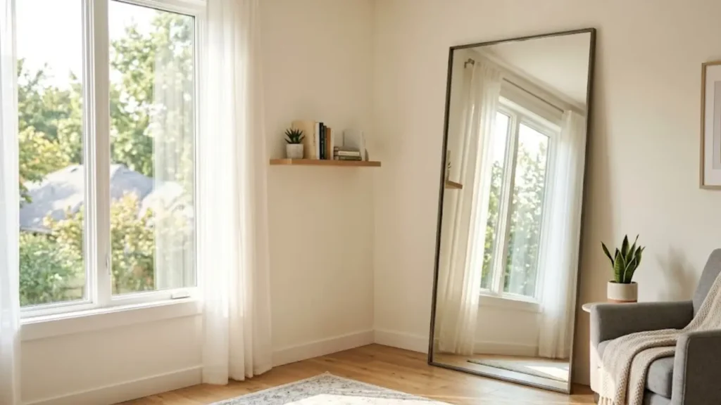
Before: A 24-inch round mirror hung on the wall next to the entrance. It was decorative and looked nice. It did almost nothing for the space.
After: A 48-inch leaner mirror was placed against the wall directly across from the room’s main window. A smaller mirror (18 by 30 inches, rectangular) was positioned on a side wall to catch the lamp’s reflection in the evening.
Why it worked:
“Add a mirror” is advice so repeated it has lost all meaning. The part that never gets explained is that where you place the mirror is the entire difference between decorative and transformative.
A mirror on a windowless wall reflects another windowless wall. All you’ve added is a decorative shape. A mirror placed directly across from a window reflects the window itself — and in doing so, doubles the apparent light source. The room has two windows instead of one. Natural light bounces, the room brightens, and the depth of the reflection makes the wall appear to recede.
In the evening, the same principle applies to artificial light. A mirror that reflects a warm lamp creates a second glow point in the room. The light wraps rather than sitting in one corner.
Size matters too. Small mirrors in small rooms are like whispering in a crowded room — they don’t carry. The minimum effective size for a standalone mirror in a living space is around 36 inches in the largest dimension. A leaner mirror is even better because it reflects the full vertical height of the room.
For a deeper breakdown of how to use mirrors specifically in a living room — including what doesn’t work — I covered this in detail in the post on making a small living room look bigger with mirrors.
Cost of this change: $45–$150 for a floor leaner mirror. IKEA and Target both have solid options in this range.
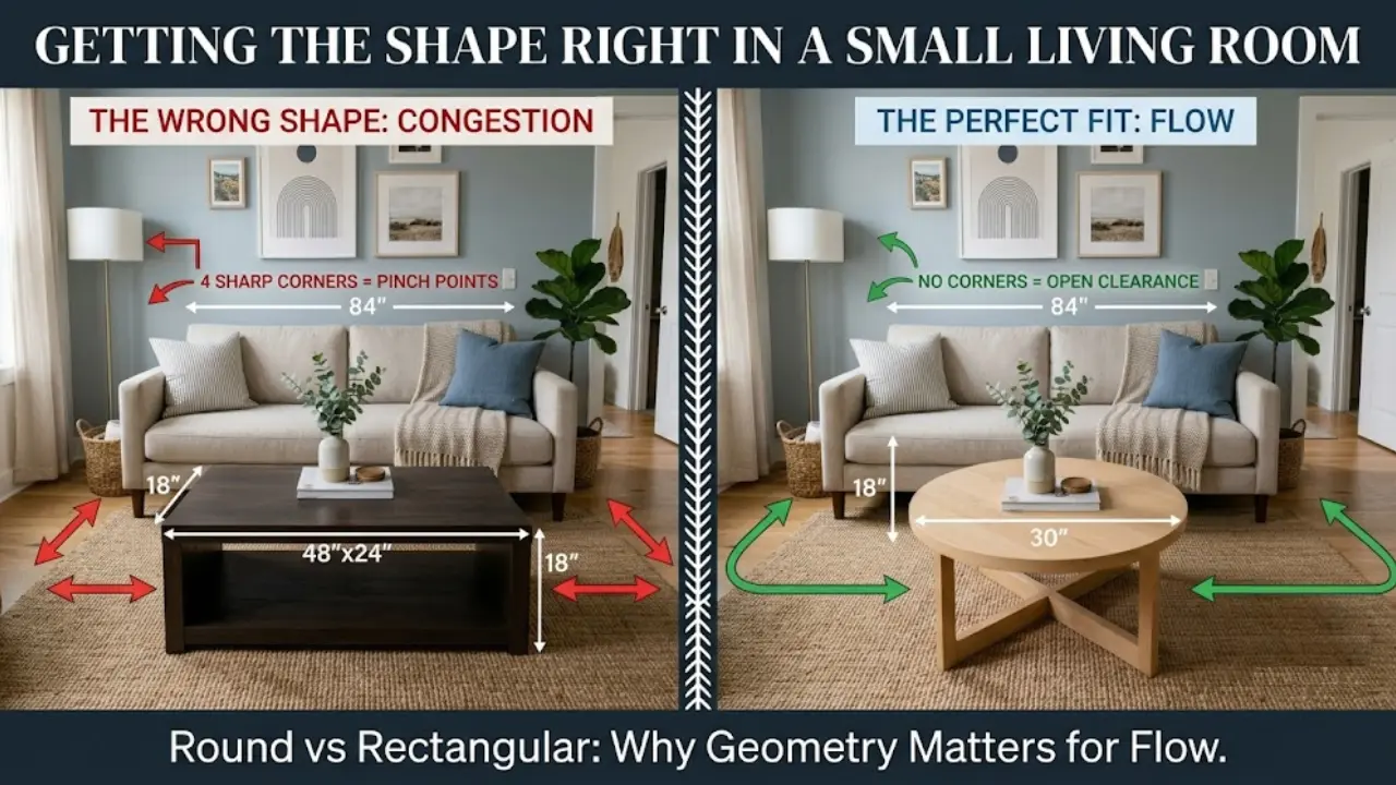
Before and After Small Space Change #6: The Rug Size Correction
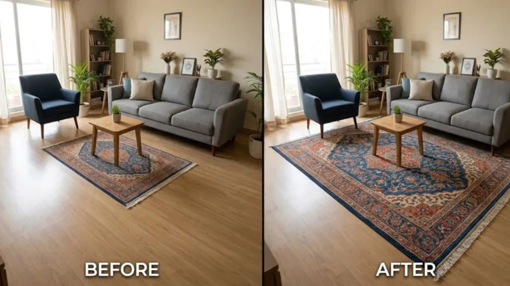
Before: A 5-by-7-foot rug sat under the coffee table in a small living room. Nice pattern, good color. But the furniture floated around it rather than relating to it. The rug looked like an island the sofa was watching from a distance.
After: The 5-by-7 was replaced with an 8-by-10. The front legs of the sofa, both chairs, and the coffee table all sat on the rug. The rug defined the entire seating zone as one unified area.
Why it worked:
This is the most counterintuitive change on the list — and also the one I’ve seen make the biggest difference in the most rooms.
The instinct in a small space is to go smaller with the rug. You don’t want it to “take over.” But a rug that’s too small for its furniture grouping makes a room feel more fragmented and therefore smaller. The furniture looks unrelated. The floor looks choppy. Nothing reads as intentional.
A properly sized rug — where at least the front legs of every major piece of seating rests on it — acts as a floor plan. It defines the living area, says these pieces belong together, and creates order from a collection of separate objects.
The rule that professional designers use: your rug should be large enough that the front two legs of each sofa and chair sit on it. In most living rooms, that means an 8-by-10 minimum. In dining areas, the rug should extend at least 24 inches past each side of the table so chairs remain on the rug when pulled out.
The before and after small space transformation here is almost always the same: the “after” looks like a room a professional put together, and the “before” looks like furniture someone moved in and never arranged. Same pieces. Different rug.
Cost of this change: A quality 8-by-10 can be found for $150–$400 through Ruggable, Wayfair, or Home Depot online. Selling the too-small rug offsets part of the cost.
How to Apply These Before and After Small Space Changes in the Right Order
Knowing which six changes work is one thing. Knowing which to tackle first — when you’re dealing with a real space with real constraints — is where the strategy lives.
Here’s the order I’d follow starting from scratch:
Step 1: Clear surfaces first. Before spending a dollar or moving anything, apply the one anchor, one accent rule to every visible surface. Takes an hour. Costs nothing. Changes how you see everything that comes next.
Step 2: Correct the rug. If the rug is the wrong size, everything else fights against it. Get this right before re-zoning the space or moving furniture.
Step 3: Float the furniture. Once the rug is right, pull pieces off the walls. Let the rug anchor them. Adjust until the grouping feels balanced.
Step 4: Fix the curtains. The highest-impact per-dollar change on this list. Order longer panels this weekend, raise the rod, extend the width.
Step 5: Address mirrors. Identify your window and place a large mirror across from it. Let the light do the rest.
Step 6: Evaluate furniture transparency. Once everything else is in place, identify the heaviest, most visually solid piece and ask whether a lighter alternative would improve the room. Sometimes the other five changes are enough. For renters applying this in a home they don’t own, all six changes are completely removable — no landlord approval needed, no security deposit risk. And if you’re working on making a rented apartment feel genuinely like home beyond just the visual fixes, there’s a broader approach in how to make a rental apartment feel like home.
What Professional Designers Do Differently in Before and After Small Space Work
Here’s something worth knowing after following designers for years: they don’t think in terms of tricks. They think in terms of proportion.
Every change on this list — the curtain height, the rug size, the furniture float — is fundamentally a proportional correction. The room was out of balance. The fix restored the relationship between objects and space.
Amateur decorating thinks about individual objects: “I need a mirror,” “I need more storage.” Professional decorating thinks about relationships: “This rug is too small for this grouping,” “This furniture is creating visual weight in the wrong corner.”
That shift in mindset is the difference between a room that looks like a collection of good purchases and a room that looks designed.
One counterintuitive move professionals make consistently: they leave more space empty than feels comfortable. When you’re used to a cluttered room, a spare one feels unfinished. It’s not. It’s breathing. Give your room permission to have empty space — especially on the floor and on surfaces — and you’ll be surprised how quickly it starts to feel larger.
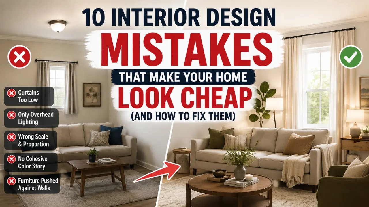
Common Mistakes That Undo Before and After Small Space Progress
Even with the best intentions, a few specific mistakes will cancel out the improvements above:
Mistake 1: Choosing furniture that’s too small. A loveseat in a room that needs a sofa doesn’t make the room feel bigger — it makes it feel like it’s missing furniture. Scale to the room’s actual needs, not to what feels “safe.”
Mistake 2: Using the ceiling as dead space. Rooms where all visual interest stops at five feet feel low regardless of actual ceiling height. Shelving that extends up, tall floor lamps, ceiling-height curtains — all of these draw the eye upward.
Mistake 3: Too many competing focal points. A small room can hold one strong focal point well. Two competing focal points create visual chaos. Pick one statement element and let everything else support it.
Mistake 4: Blocking natural light. Furniture in front of a window, heavy curtains that stay mostly closed, shelving that cuts off sightlines to light — all of these shrink the room visually. Light is the most effective space-expander available, and it’s free.
Mistake 5: Ignoring vertical space. In a small footprint, vertical space is your only real expansion. Shelving that goes all the way up, tall headboards, vertical art groupings — all add the illusion of height.
The Real Point of Before and After Small Space Changes
These six before and after small space changes — furniture placement, transparency, curtain height, clutter reduction, mirror strategy, rug size — are not about making a small space look like something it isn’t. They’re about making it feel like the best version of what it actually is.
Small spaces done well feel intentional. Every element earns its place, every corner has a purpose, and the room communicates something rather than just containing things.
You already have most of what you need. Start with one change this weekend — the surfaces or the curtains — and see what it does to how the room feels. That shift is usually the one that makes everything else click.
If you’re working with a strict budget and want a full room plan you can actually execute, the step-by-step breakdown in how to decorate a rental apartment on a budget walks through exactly how to prioritize these decisions when money is the real constraint.
FAQ — Before and After Small Space Changes
What is the most impactful before and after small space change with no budget?
Moving furniture off the walls — what designers call floating the furniture — is the highest-impact zero-cost change in most small rooms. Pulling sofas and chairs even six to ten inches from the wall creates visual depth, allows a rug to anchor the grouping properly, and makes the room read as intentional rather than cramped. It takes about 20 minutes and consistently transforms how a space feels.
What rug size is right for a small living room?
For most small living rooms, an 8-by-10 rug is the minimum effective size. The rug should be large enough that at least the front two legs of every major seating piece rest on it. A rug that’s too small — a 5-by-7 under a full sofa grouping — makes furniture look disconnected and the room feel fragmented, which reads as smaller rather than larger.
Where should you place a mirror in a small room to make it look bigger?
Place the mirror directly across from the room’s main light source — ideally directly opposite a window. This reflects natural light back into the room, effectively doubling the perceived light source and adding visual depth. A mirror on a dark or windowless wall reflects nothing of visual interest. Aim for at least 36 inches in the largest dimension for a meaningful effect.
Does transparent furniture really make a small room feel bigger?
Yes, consistently. Solid, opaque furniture reads as mass — even a small piece registers as heavy to the eye. Acrylic, glass, or open-frame furniture allows light and sightlines to pass through, which keeps visual weight lower and the floor more visible. The best candidates for this swap are coffee tables, side tables, and media consoles — the pieces that sit closest to seated eye level.
How do you start before and after small space changes on a tight budget?
Start with what costs nothing — clear every surface to one anchor and one accent item, pull furniture off the walls, and reposition any existing mirror to face a window. These three moves cost $0 and make a measurable difference. If you have $80–$150, the single highest-ROI purchase is ceiling-height curtain panels mounted just below the ceiling and extending past the window frame on each side.


1 Comment
[…] you want to see what a difference these swaps actually make in a real space, check out these before and after small space transformations — the dual-purpose furniture results especially are pretty […]