
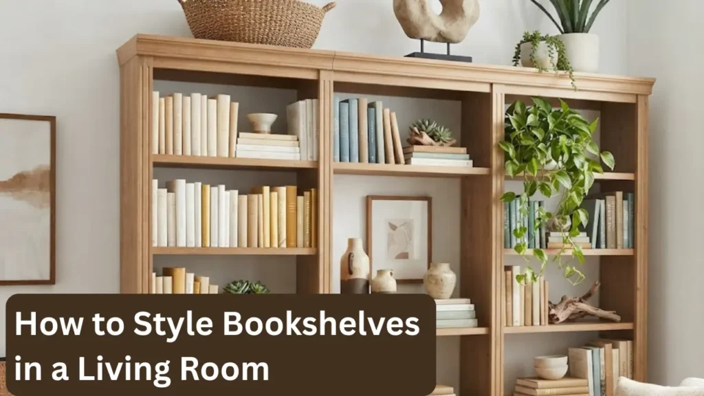

A bookshelf that’s just storage looks like a wall of clutter. A bookshelf that’s been styled well looks like a considered piece of the room, something that adds warmth, personality, and visual interest rather than just holding objects that don’t have anywhere else to go.
The difference between those two outcomes isn’t talent or an eye for design. It’s understanding a handful of consistent principles about balance, proportion, color, and negative space that professional stylists use every time. Once you know what those principles are, figuring out how to style bookshelves in a living room becomes considerably less mysterious and more like a straightforward process you can repeat on any shelf configuration.
These 11 tips cover every element of bookshelf styling, from the initial decisions about what goes where to the small finishing touches that make the difference between shelves that look fine and shelves that actually look good.
Why Bookshelf Styling Is Harder Than It Looks
Most people approach bookshelf styling the way they approach unpacking boxes: put the books on the shelf, fill the remaining space with objects, and hope it comes together. It almost never does, because bookshelf styling isn’t really about placement. It’s about composition, and composition requires understanding a few visual principles that aren’t intuitive.
The first principle is that a bookshelf reads as a unit, not as a collection of individual items. The eye sees the whole shelf before it sees any individual object on it. This means the shelf’s overall balance, the distribution of visual weight, color, and height variation across the whole thing, matters more than whether any single item is attractive.
The second principle is that negative space is an active element, not an absence. An empty section of shelf isn’t wasted space. It’s a visual rest that makes everything around it look more intentional. The shelves that consistently look best have roughly 20 to 30 percent of their surface area as open space rather than filled space.
The third principle is that the same object looks completely different depending on what’s around it. A ceramic vase that looks awkward floating alone on a shelf reads as intentional when grouped with a small stack of books and a plant. Context is everything in shelf styling, and understanding how objects relate to each other is what separates a shelf that looks curated from one that looks accumulated.
1. Start by Clearing Everything Off
This sounds like a step that wastes time, but it’s the one that produces the most consistent results. Styling a bookshelf on top of its existing contents means working around whatever was already there, which makes it nearly impossible to see the shelf clearly or make genuinely considered decisions about what belongs and where.
Starting from zero, with the shelf completely empty, does two useful things. It forces a decision about what actually deserves to be on the shelf, which usually results in removing 30 to 40 percent of what was there before. And it lets you see the shelf’s actual proportions, the width of each bay, the height between shelves, the relationship between sections, which determines what will fit and what will look right.
Before putting anything back, spend a moment looking at the empty shelf the way you’d look at a blank canvas. The structure of the shelf itself, its proportions and the spacing between sections, is the starting point for every styling decision that follows.
2. Group Books by Color, Not by Subject
Most people organize books by subject or author, which is useful for finding things but produces a visually chaotic shelf because spines in different colors, sizes, and fonts compete equally for attention. Grouping books by color instead, even loosely, creates visual order that makes the shelf read as considered rather than random.
This doesn’t mean every shelf needs to be a perfect color gradient. It means clustering similar-toned books together and keeping high-contrast color jumps to a minimum. A row of cream and white spines next to a cluster of dark navy and black reads as a deliberate palette choice. The same books arranged in random order look like a charity shop donation pile.
If reorganizing by color means you can’t find books easily, a practical compromise: keep the books you reference most often organized by subject in one section of the shelf, and arrange everything else by color. The functional section and the styled section can coexist on the same bookcase as long as they’re visually separated.
The color-first approach to book organization is something Apartment Therapy’s tested bookshelf organization methods covers with specific before-and-after examples that show how dramatic the visual difference is even with the same books.
3. Mix Horizontal and Vertical Book Stacks
Books arranged only vertically, spine-out in a continuous row, create a flat, uniform surface with no height variation. Adding horizontal stacks, groups of two to five books lying flat on their sides, breaks that uniformity and creates platforms for displaying objects on top of them.
A horizontal stack also solves a common practical problem: what to do with the space at the end of a row of vertical books when there aren’t enough books to fill the full shelf width. A horizontal stack at one end, with an object resting on top, fills the space more intentionally than a few vertical books leaning against a bookend.
The ratio that works well: roughly two-thirds of the shelf in vertical books and one-third in horizontal stacks or open space. This gives enough visual variation to feel dynamic without making the shelf look like it’s only half organized.
4. Use Odd Numbers for Object Groupings
Objects grouped in threes, fives, or sevens look more natural than groups of two or four, because the eye can’t settle into a symmetrical pattern and finds the odd grouping more dynamic and interesting. This is one of those styling rules that sounds arbitrary until you test it by placing two identical objects side by side and then adding a third: the third object immediately makes the grouping feel more alive.
In practical bookshelf terms, this means grouping decorative objects in threes when possible. A small plant, a ceramic object, and a candle in a cluster reads better than two matching bookends with nothing between them. A tall vase, a medium sculptural object, and a small stacked book reads better than two vases of similar height.
The odd-number principle works for books too. A horizontal stack of three books looks more intentional than a stack of two, and a cluster of five vertical books next to a horizontal stack reads more naturally than the same cluster with four.
5. Vary the Heights Within Each Section
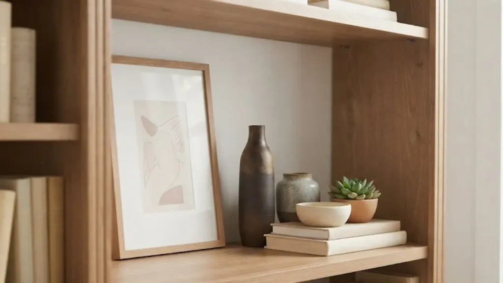
A shelf where everything sits at the same height, all books roughly the same size, all objects at similar levels, reads as flat and boring from a distance. Height variation is what creates the up-and-down rhythm that makes a bookshelf look dynamic when you step back and look at it as a whole.
The approach that works: within each section of the shelf, aim for at least three distinct heights. One tall element (a plant, a tall vase, a stack of books with an object on top), one medium element (a ceramic, a framed photo, a medium plant), and one low element (a small object, a short candle, a few horizontal books). This creates a visual triangle within each section that the eye finds satisfying without it looking deliberately arranged.
This height variation principle is the same one that makes tabletop and console styling work in any room. The styled console table that always photographs well in living rooms uses exactly this principle: one tall element (usually a lamp), one medium element (a vase or artwork), and one low element (a small object or stack of books). The guide to making a small living room look expensive covers this console and tabletop styling approach in the context of making a whole room feel more considered.
6. Leave Deliberate Negative Space
This is the principle most people resist the most, because leaving space on a bookshelf feels like waste when there are plenty of things that could fill it. But negative space on a shelf serves the same function as silence in music: it makes everything around it more distinct and more intentional.
A shelf that’s completely full reads as storage. A shelf with deliberate open sections reads as styled. The negative space gives the eye somewhere to rest between groupings, which makes each individual grouping more visible and more impactful than it would be if surrounded by more objects.
The rough guideline: 20 to 30 percent of each shelf should be empty. On a shelf with five feet of horizontal space, that’s roughly one foot of intentional open space distributed across the shelf’s sections. The empty space doesn’t need to be in one continuous gap. It can be the space above a horizontal book stack, the space between two groupings, or the space beside a single tall object standing alone.
7. Incorporate Organic Elements
A bookshelf with only books and decorative objects tends to feel slightly cold and static, regardless of how well the other styling principles are applied. Adding at least one organic element, a living plant, a trailing vine, a small vase with dried stems, a piece of raw wood or a woven basket, introduces warmth and texture that inanimate objects can’t provide.
Plants work particularly well on bookshelves for a reason beyond their visual appeal: they add movement. A trailing pothos or an ivy that drapes slightly over a shelf edge creates a soft, organic line that contrasts with the rectilinear structure of the shelf and makes the whole unit feel more alive.
Low-light tolerant plants are the practical choice for bookshelves that aren’t near windows. Pothos, snake plants, and small ZZ plants handle the reduced light conditions of an interior bookshelf without struggling. A plant that’s visibly failing on a bookshelf does the opposite of what a healthy plant does, so matching the plant to the actual light conditions of the shelf matters more than choosing the most photogenic option.
8. Use Art and Frames Thoughtfully
Leaning a small framed print or piece of art against the back wall of a shelf rather than hanging it does something specific: it adds depth, because the frame sits in front of the books behind it and creates a layered effect rather than a flat one. A shelf with a mix of standing frames, horizontal books, and objects has more visual depth than one with only objects at consistent distances from the front edge.
The practical note: frames that lean need to be stable. A narrow shelf with a heavy frame creates a tipping risk. Smaller prints in lightweight frames, or even just a piece of art propped against a stack of books, work better than a full-size framed piece in an unstable position.
Keeping frames in consistent metal finishes (all black, all brass, all natural wood) rather than a mix of different frame styles reads as more considered. Mismatched frames on a bookshelf have the same fragmenting effect as mismatched metals elsewhere in the room, which is one of the common interior design patterns worth understanding broadly. The full breakdown of how small mismatches compound to make a room look unpolished is in this guide to common interior design mistakes.
9. Keep One Section More Minimal Than the Others
Most people try to style every section of a bookshelf at the same level of visual complexity, which creates a shelf that’s uniformly busy from one end to the other. Having one section that’s deliberately more minimal, fewer objects, more negative space, a single plant with a stack of books and nothing else, gives the eye somewhere to rest and makes the more styled sections feel intentional rather than random.
This is a specific application of the editing principle that applies throughout small space decorating. A living room with one clear, uncluttered wall feels more spacious than one where every wall has something happening. A bookshelf with one simple section feels more curated than one where every shelf is equally full. The contrast between busy and calm sections is what creates the visual rhythm that makes a bookshelf interesting to look at.
The same editing discipline, applied to a living room’s surfaces and visible elements generally, is covered in this breakdown of how to decorate a small living room without clutter.
10. Style the Top of the Bookshelf
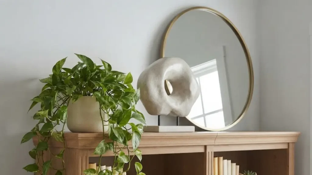
The top of a tall bookshelf is one of the most underused surfaces in a living room. It’s either left completely bare, which makes the shelf look unfinished from a distance, or it becomes a dumping ground for items that don’t fit anywhere else, which makes it look like overflow storage.
Styling the top of a bookshelf with two or three considered objects, a large plant that adds height above the shelf, a sculptural piece, a basket, creates a visual moment that completes the bookshelf as a unit rather than leaving it looking like it stops abruptly. The top is also one of the best spots for larger or heavier objects that would dominate a shelf if placed within it.
The practical rule for top-of-shelf styling: objects here should be taller or larger than anything on the shelves below, so they read as the visual peak of the whole unit rather than as an afterthought. A floor-to-ceiling bookshelf is a significant architectural element in a small living room, and styling the top properly makes the whole room feel taller.
11. Step Back and Edit After Every Round
Bookshelf styling is iterative. The arrangement that looks right when you’re standing close to the shelf often looks different when you step back to the doorway and see it as part of the whole room. And the arrangement that looks right after the first pass often has at least one element that needs adjusting after you’ve lived with it for a few days.
The habit that makes the most difference: after finishing each styling pass, walk to the other side of the room and look at the bookshelf from the same distance you’d normally see it from. Notice which sections draw the eye first (these are usually the most visually interesting or the most visually busy), which sections get ignored (these are usually too uniform or too empty), and whether the overall shelf reads as balanced or weighted to one side.
From there, make one change at a time and evaluate each adjustment from the same viewing distance. Small adjustments, moving one object, adding a horizontal book stack, removing one element, often have larger effects than expected when seen from across the room.
Bookshelf Styling in Different Room Contexts
The styling principles above work across different types of bookshelves, but the emphasis shifts slightly depending on the room context.
In a small living room specifically, the bookshelf is doing additional visual work beyond just holding books and objects. A tall bookshelf draws the eye upward and creates a sense of ceiling height that matters when the room is compact. Keeping the color palette of the shelf’s objects within the living room’s broader palette connects the shelf to the rest of the room rather than making it read as a standalone element. The small living room layout ideas guide covers where a tall bookshelf fits most effectively within different room configurations, including which walls create the best visual effect for a floor-to-ceiling unit.
In a living room with a neutral backdrop, like white or light gray walls, the bookshelf becomes one of the primary sources of color and personality in the room. This is actually an advantage for styling: the neutral wall behind and around the bookshelf means you can introduce color through the books and objects without competing with a strong wall color. Rooms with white walls specifically, where the bookshelf is often the room’s most visually interesting element, benefit from slightly more color range on the shelf than rooms where the walls are already carrying a strong color. The approach to decorating a room with white walls as the base is covered in this guide to decorating a bedroom with white walls, and the same logic of using objects and textiles to introduce color against a neutral backdrop applies in a living room context.
In a rental living room, where the walls can’t be painted and the bookshelf becomes an even more important element for adding personality, the styling principles here are the same but the stakes are slightly higher. A well-styled bookshelf in a rental can do more to make the space feel personal and considered than almost any other single element that doesn’t require permanent modification. Both decorating a rental apartment on a budget and how to make a rental apartment feel like home cover how the bookshelf fits into the broader strategy of making a temporary space feel genuinely personal.
Common Bookshelf Styling Mistakes Worth Knowing
A few patterns show up consistently in bookshelves that are clearly trying to be styled but aren’t quite working.
Filling every inch. The instinct to use all available space results in a shelf that reads as storage rather than styling. Twenty to thirty percent negative space is not waste. It’s the element that makes everything else look intentional.
Too many colors. A bookshelf with objects in every color of the spectrum competes with itself. Limiting the object palette to two or three accent colors within the room’s existing palette creates the cohesion that makes a shelf read as designed.
Objects all at the same size. Styling with objects that are all similar in scale, all small or all medium, produces a uniform surface that the eye slides past. Scale variation, at least three distinct sizes within each section, creates the visual interest that makes a shelf worth looking at.
Ignoring the books entirely. Some bookshelf styling approaches treat the books as background material and focus entirely on the decorative objects. Books are actually one of the most versatile and visually rich elements on a shelf: their spines add color, their varying heights add rhythm, and their stacked forms add interesting geometric shapes. Using books actively in the composition, rather than treating them as filler between the real decor, almost always produces a better result.
The broader pattern behind these mistakes, the tendency to fill space rather than compose it, connects to a wider set of decorating habits that affect how a whole room reads. The version of this that applies to an entire living room rather than just a bookshelf is covered in the guide to small living room layout mistakes, which documents how the same filling-rather-than-composing instinct plays out at the room scale.
Putting It Together: How to Style Bookshelves in a Living Room
The most consistent result from bookshelf styling comes from working through the principles in a specific order: clear everything off first, decide what deserves to be there, group books by color with horizontal stacks for variation, then add decorative objects in odd-number groupings at varying heights, incorporate one organic element per section, and leave deliberate negative space throughout.
After the first pass, step back and edit. Then live with it for a few days before making final adjustments, because the initial impression from across the room and the impression after a week of living with it are often different, and the second one is the more accurate read of how the shelf actually works in the room.
A well-styled bookshelf doesn’t just look good in photos. It changes the way a living room feels to spend time in, because it adds warmth, personality, and visual interest without adding clutter. In a small apartment where the living room is doing multiple jobs at once, that combination of functional storage and genuine visual interest is one of the hardest things to achieve and one of the most impactful when it works.
For a broader look at how bookshelf styling fits into the larger project of making a small living space feel both organized and visually considered, the home organization ideas for small spaces guide covers vertical storage and display from the organizational angle, and the small apartment living room ideas collection shows how a styled bookshelf functions within complete small living room setups.