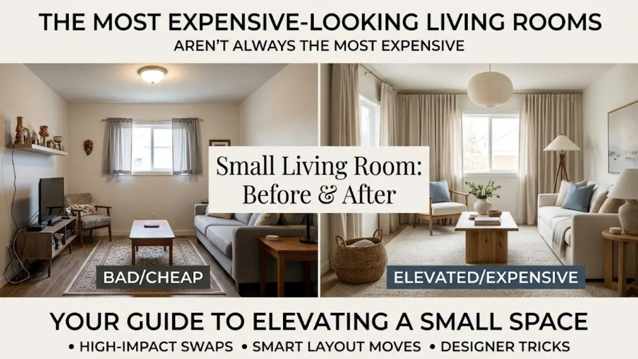
Introduction: Interior Design Mistakes
A home doesn’t look cheap because of how much money was spent in it. I’ve seen apartments furnished entirely from thrift stores that look polished and intentional, and I’ve seen rooms full of expensive furniture that still feel off somehow. The difference almost always comes down to a handful of repeated mistakes, not budget.
Most of these mistakes are small. A curtain rod hung too low. A lamp that’s the wrong height. Furniture pushed flush against every wall because that’s just what people do. None of them are expensive to fix, but all of them have an outsized effect on how a room reads.
I’ve made every single mistake on this list at some point, usually in a rental apartment with no budget for a redesign. What changed things wasn’t spending more money. It was understanding why these specific choices were working against the room, and fixing them one at a time.
Here are the 10 mistakes I see most often, why they make a space look cheap even when it isn’t, and exactly what to do instead.
1. Hanging Curtains Too Low and Too Tight
This is probably the single most common mistake in home decor, and it’s almost always unintentional. Curtain rods get installed right above the window frame because that seems like the obvious place for them. The curtains end up the exact width of the window, sometimes even narrower.
The problem is that this makes ceilings look lower and windows look smaller than they actually are. It’s a small detail that quietly undercuts the whole room.
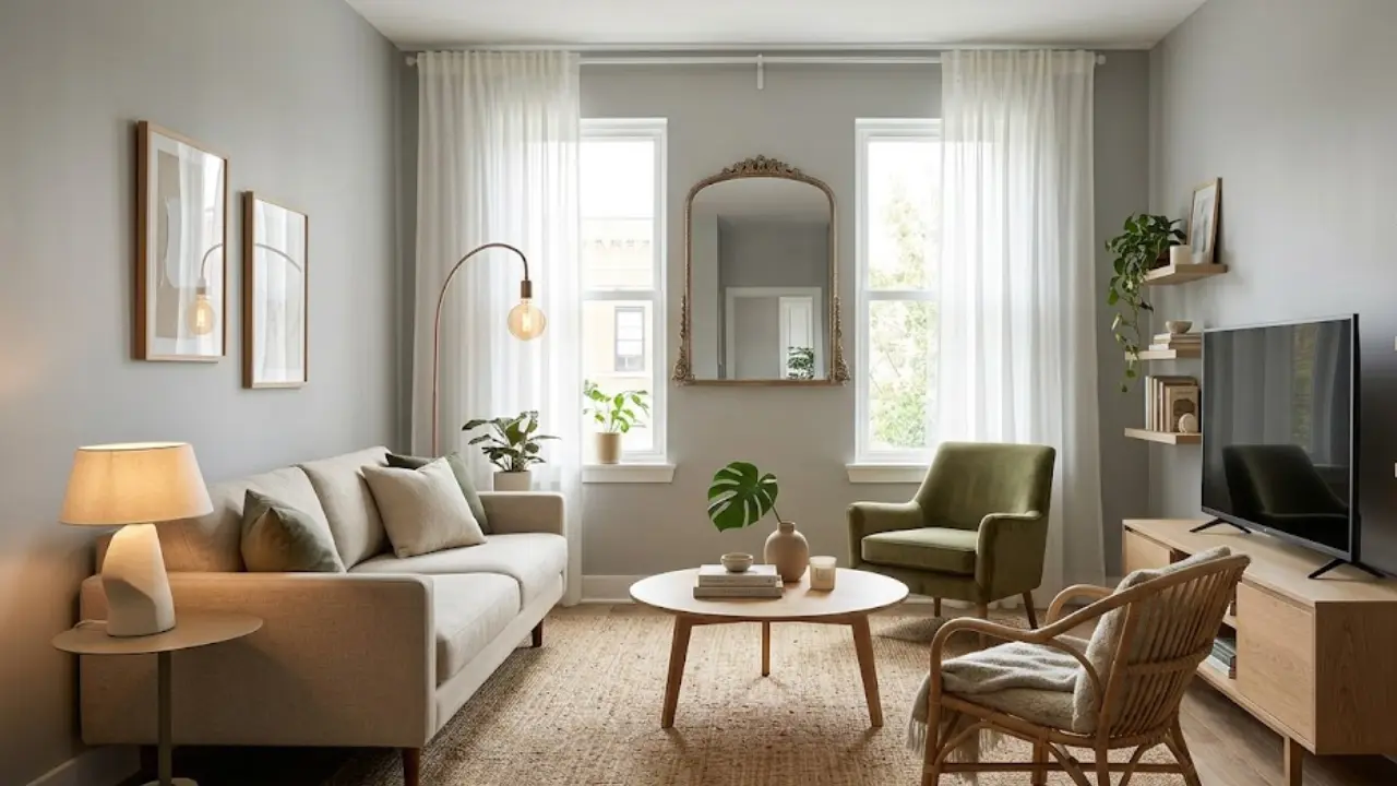
The fix is simple and doesn’t cost anything beyond the rod itself. Hang the curtain rod 4 to 6 inches above the window frame, and extend it 4 to 8 inches past each side of the window. This creates the illusion of a taller, wider window, which makes the entire wall and room feel more expansive. The curtains themselves should graze the floor or just barely puddle. Curtains that stop several inches above the floor look like they were bought off the rack without measuring, which they usually were.
In a small space, this single change can do more for the room’s perceived size than almost anything else on this list.
2. Relying on a Single Overhead Light
Most rentals and older homes come with one ceiling fixture per room, and most people leave it at that. The result is flat, harsh light that washes out the whole space and leaves corners and seating areas in shadow. Photographers call this “uplighting” when it’s bad, and it makes rooms look like offices, not homes.
Real lighting design uses at least three layers: overhead (ambient), task (lamps near where you read or work), and accent (smaller lights that highlight a corner, a shelf, or art). A room with just one overhead light is missing two-thirds of what makes a space feel warm and considered.
The cheapest fix is a floor lamp and a table lamp, both with warm-toned bulbs (look for 2700K to 3000K color temperature, not the cool blue-white of standard LED bulbs). Place one lamp near the seating area and one in an underused corner. The difference this makes at night is dramatic, and it costs less than most decor items people buy instead.
If you’re working on a bedroom specifically, lighting layers matter even more there because the room serves both relaxing and functional purposes. The detailed breakdown in 15 ways to make a bedroom feel cozy on a real budget covers specific lighting setups that work in rented spaces without any rewiring.
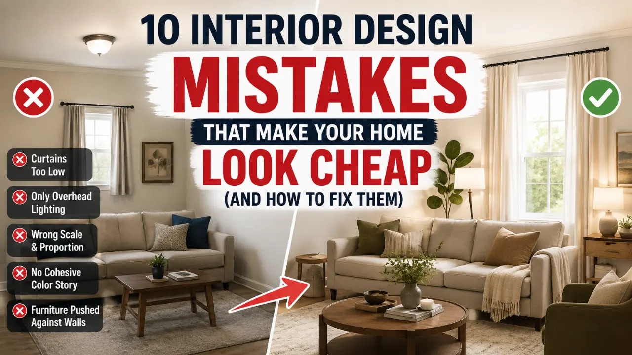
3. Ignoring Scale and Proportion
Furniture that’s the wrong size for a room is one of the fastest ways to make a space feel off, and it’s surprisingly common. A tiny coffee table in front of a large sofa looks like an afterthought. A massive armchair in a small room overwhelms everything around it. Art hung too small on a large wall looks like it’s floating in empty space.
The rule of thumb that actually works: a coffee table should be roughly two-thirds the length of the sofa it’s paired with. Art above a sofa or console should span at least two-thirds of that furniture piece’s width, not a small frame centered awkwardly in the middle of a much longer wall.
Rugs are a frequent victim of this mistake too. A rug that’s too small for the seating area it’s supposed to anchor makes the whole room look disjointed, like the furniture is floating disconnected from everything around it. Getting proportions right is one of those things that’s invisible when done correctly and glaringly obvious when it’s wrong.
4. Skipping the Cohesive Color Story
Rooms that look cheap often have colors that were chosen one piece at a time, with no relationship to each other. A blue accent pillow here, a green throw blanket there, a random orange lamp because it was on sale. Individually, none of these choices are bad. Together, they read as chaotic.
A cohesive room doesn’t mean everything matches exactly. It means there’s a deliberate palette, usually two to three main colors plus one or two accents, that repeats throughout the space in different forms (a wall color, a rug, a pillow, some artwork). When colors repeat with intention, the eye reads the room as designed rather than assembled.
This is one of the most common issues in rental apartments specifically, where walls are often a landlord-approved neutral and tenants add color through furniture and decor without a plan. If you’re working with a rental’s existing wall color, the article on decorating a rental apartment on a budget covers how to build a cohesive palette within those constraints.
5. Pushing Every Piece of Furniture Against the Wall
This is a habit almost everyone has, usually because it feels like the “safe” choice that maximizes floor space. But a room where every single piece of furniture is pressed against a wall often ends up with a big, awkward, empty center and a seating area that feels disconnected rather than inviting.
Floating furniture, even just a few inches away from the wall, creates depth and makes a room look intentionally arranged rather than just stored along the perimeter. This applies to sofas, bookshelves, and even beds. A bed pulled a foot away from the wall, with a narrow table behind it, reads completely differently than the same bed jammed into a corner.
This mistake compounds in small rooms, where the instinct to hug every wall is strongest, but the payoff for floating furniture intentionally is also strongest there.
6. Mismatched or Missing Hardware and Fixtures
Cabinet pulls, light switch covers, doorknobs, and curtain rods are small details, but they’re details people notice even when they can’t articulate why a space feels unfinished. A kitchen with five different metal finishes (brass faucet, chrome cabinet pulls, black light fixture, silver appliances) reads as disorganized, even if every individual piece is nice on its own.
The fix doesn’t require replacing everything. Picking one or two metal finishes and being consistent wherever realistic (swapping cheap cabinet pulls is inexpensive, for example, even when you can’t replace the faucet) makes a noticeable difference. In a kitchen specifically, this kind of small upgrade has an outsized visual impact relative to its cost, especially when paired with other low-cost changes like open shelving or better organization. The piece on kitchen open shelving ideas covers how small structural changes like this can transform a kitchen’s whole feel without a renovation.
7. Letting Clutter Take Over Visible Surfaces
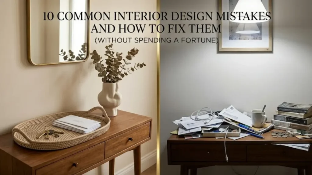
There’s a difference between a lived-in home and a cluttered one, and the line is usually about visible surfaces. Countertops, coffee tables, console tables, and shelves that are covered in miscellaneous items (mail, chargers, random knick-knacks) make a room look chaotic regardless of how nice the underlying furniture and decor actually are.
This doesn’t mean a home needs to look like a showroom with nothing personal in it. It means giving things a home. A small tray on a console for keys and mail. A drawer for chargers instead of a tangle on the counter. A few curated objects on a shelf instead of every object you own displayed at once.
The psychological effect of clear surfaces is real. A room with visual breathing room, even a small one, reads as calmer and more intentional than a room twice the size that’s visually busy everywhere you look.
8. Forgetting About the Floor Plane
Bare floors with no rug, or rugs that don’t connect to anything, are an easy way to make a room feel unfinished. The floor is roughly a third of what you see when you walk into a room, and an empty or poorly chosen floor plane drags down everything above it.
This isn’t only about rugs, although rug size and placement matter enormously (a rug too small for its furniture grouping is one of the most common mistakes in home decor generally). It’s also about flooring transitions, worn or mismatched floor coverings between rooms, and forgetting that the floor needs to participate in the room’s overall color story the same way the walls and furniture do.
A well-chosen rug in the right size, placed correctly under furniture, does more to elevate a room’s perceived quality than almost any other single purchase. It’s one of the fastest ways to make a space feel finished rather than in-progress.
9. Treating Every Room Like a Blank Slate Instead of Building on Bones
Many homes, especially rentals, come with existing architectural features: trim, built-ins, an awkward alcove, a fireplace that doesn’t quite work with modern furniture. The mistake is ignoring these features and decorating as if the room were a blank box, rather than working with what’s already there.
A white-walled bedroom with strong trim detail and good natural light has bones worth highlighting, not painting over or ignoring. The fastest way to make a room with good architectural bones look cheap is to decorate in a way that competes with those features instead of complementing them. For specific strategies on working with the bones of a white-walled room rather than against them, decorating a bedroom with white walls goes into how color, texture, and layering can elevate a neutral starting point without a full repaint.
This principle extends to small or awkward spaces too. A weird nook, a low ceiling, an oddly placed window: these are challenges, but they’re also opportunities to create something distinctive rather than generic. The comparison of real transformations in before and after small space changes shows what’s possible when you design around a room’s existing constraints rather than fighting them.
10. Decorating Without a Plan for How the Space Is Actually Used
This last mistake is less visual and more functional, but it shows up visually in the end. A living room arranged for how it looks in photos, rather than how it’s actually used day to day, eventually accumulates small workarounds: a laptop charger draped over a “decorative” side table, a blanket that doesn’t match anything because the styled one wasn’t actually warm enough, a chair nobody sits in because it’s angled for visual symmetry rather than comfort.
Over time, these mismatches between form and function make a space feel less put-together, not more, because the gap between how it’s styled and how it’s lived in becomes visible. A home that looks genuinely good, not just photogenic, is one where the design decisions actually match daily life.
This matters most when you’re settling into any new space, including a rental you don’t plan to be in forever. The goal isn’t to under-invest because it’s temporary. It’s to design around your actual routines from day one. The approach laid out in how to make a rental apartment feel like home covers this balance directly, building a space that’s both personal and functional without assuming permanence is required for either.
What Actually Separates an Expensive-Looking Home From a Cheap-Looking One
After going through all 10 of these, a pattern becomes clear. None of them are really about money. They’re about intention, proportion, and consistency. A $200 lamp in the wrong spot with the wrong bulb temperature won’t outperform a $20 lamp placed thoughtfully with a warm bulb in a dark corner that needed it.
The homes that look the most put-together, regardless of budget, are the ones where every choice seems to relate to every other choice. The curtains are the right height. The lighting has layers. The colors repeat with intention. The furniture is sized for the room. Nothing is fighting for attention, and nothing is forgotten.
If you’re working through a budget renovation or refresh, the order I’d actually prioritize based on cost versus visual impact: lighting layers first (cheapest, biggest impact), curtain height second, then rug sizing, then addressing any obvious clutter on visible surfaces. Hardware swaps and bigger furniture changes can come later once the fundamentals are solid.
Common Questions People Asked About Interior Design Mistakes
It’s worth addressing a few things that come up constantly once people start noticing these issues in their own homes.
Can you fix all of this without spending much money?
Mostly, yes. Curtain height is a rod and a slightly longer curtain panel. Lighting layers can start with one lamp from a thrift store. Decluttering costs nothing. The most expensive items on this list (a properly sized rug, swapping cabinet hardware) are still relatively low-cost compared to furniture or renovation.
Do these mistakes matter more in small spaces?
Generally yes, because small rooms have less margin for error. A proportion mismatch or a cluttered surface is more visually dominant in 150 square feet than in 400 square feet. That said, every one of these mistakes shows up in large homes too, just with more room to hide.
Is it possible to over-correct and make a space feel sterile?
It is, and that’s worth watching for. The goal of fixing these mistakes isn’t to create a showroom. It’s to remove the things that are actively working against the room while keeping the personality and lived-in warmth that makes a home feel like yours.
Where to Start
If all 10 of these feel overwhelming at once, don’t try to fix everything in a weekend. Pick the one or two that feel most obviously true in your own space right now. For most people, that’s either the curtain height or the single-overhead-light problem, because both are inexpensive, fast to fix, and produce a visible difference almost immediately.
Once you’ve made one change and noticed the shift, the rest tend to follow naturally, because you start seeing your space with a more critical eye. That shift in perception, more than any individual fix, is what actually changes how a home looks and feels over time.