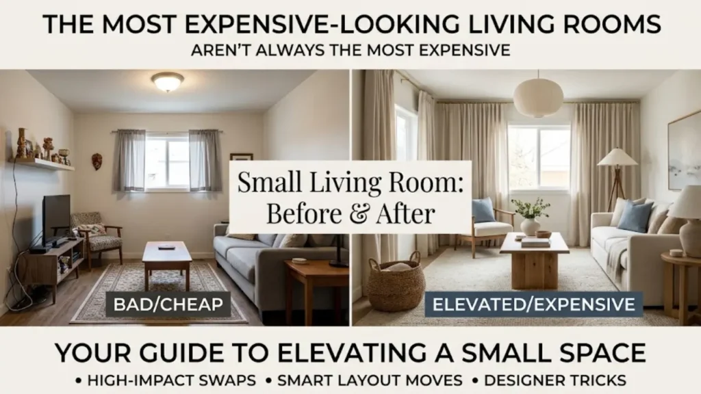
The most expensive-looking living rooms I’ve ever walked into weren’t always the most expensively furnished ones.
I’ve been in apartments with five-figure sofas that felt cluttered and cold. And I’ve been in tiny rentals where everything came from a thrift store or a budget retailer, and the room felt pulled-together, calm, and genuinely elevated. The difference was never really about money. It was about decisions.
Knowing how to make a small living room look expensive is a specific skill. It’s not about buying more things or spending more money. It’s about understanding the visual cues that signal quality and applying them deliberately. Designers do this instinctively. Once you understand the underlying logic, you can do it too.
This guide covers everything: the specific swaps that have the highest visual impact, the habits that make a room look cheap without you realizing it, the textures and finishes that read as luxury even when they’re not, and the layout moves that make a small room feel like it was professionally designed. By the end, you’ll have a clear action plan you can start on this weekend.
Why Small Rooms Are Actually Easier to Make Look Expensive
Here’s something most decorating guides won’t tell you: small rooms have a real advantage when it comes to looking expensive.
In a large room, you need a lot of furniture, a lot of art, a lot of everything to fill the space and make it feel cohesive. In a small living room, you need less. That means you can afford to invest more in fewer, better things. A single beautiful lamp. One genuinely high-quality throw. A rug that actually has texture and depth. These things cost what they cost, but in a small room, you only need one or two of them to shift the entire feel of the space.
The other advantage is that small rooms reward restraint. Negative space, which is the empty area around and between objects, is one of the most powerful signals of a well-designed room. Expensive-looking rooms always have breathing room. They never look crammed. In a small living room, editing down to fewer, better pieces creates that negative space naturally.
The problem most people run into is the instinct to fill. Every surface gets something. Every corner gets a chair. Every shelf gets topped up. The room ends up looking busy and slightly chaotic, which is the opposite of expensive. The first step to making a small living room look expensive is deciding what to take out, not what to put in.
The Foundation: Get These Things Right First
Before any styling trick works, a few fundamentals have to be in place. These are the things that quietly undermine an otherwise well-decorated room.
Clean Lines and a Clear Floor
Nothing signals budget decorating faster than a cluttered floor. Visible cables, shoes near the door, stacks of things that don’t have a home. These details are small individually, but together they create an impression of disorder that no amount of nice furniture can overcome.
In a small living room, the floor is a significant percentage of the visual field. When it’s clear, the room immediately reads as more spacious and more intentional. Start here before you buy anything new. Remove everything from the floor that doesn’t need to be there. Find a home for the cables. Put the shoes away. This costs nothing and makes an immediate difference.
A Cohesive Color Story
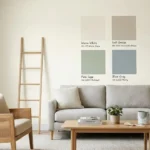
Expensive-looking rooms have a clear, limited color palette. Usually three colors: a dominant neutral, a secondary accent, and one pop color used sparingly. When a room has too many colors competing, a blue sofa against an orange rug with green throw pillows and yellow curtains, it looks scattered, regardless of how much each individual piece cost.
Before you add anything, identify your three colors. For most small living rooms, the dominant neutral is the wall color or the sofa. The secondary accent is usually a wood tone or a metal finish. The pop color appears in the rug, a cushion, or a single piece of art. Everything else should support those three, not compete with them.
If your room currently has too many colors, you don’t have to replace everything. Sometimes swapping out throw pillows and a rug is enough to pull the palette into cohesion.
Scale That Fits the Room
Furniture that’s too small for a room looks cheap. Furniture that’s too large looks cramped. Scale is one of the most important and most frequently ignored principles in small living rooms.
The most common scale mistake is buying a sofa that’s too small because you’re worried about fitting it in. A sofa that’s proportionally correct for the room, even if it feels slightly large when you’re measuring, will almost always look better in place than a loveseat that floats in the middle of the room looking like it got lost.
The same applies to coffee tables, side tables, and rugs. A properly sized rug, one large enough for at least the front legs of all seating to rest on, does more for the look of a room than almost any other single purchase. The full breakdown of sizing is in the guide on how to choose a rug for a small living room, but the short version is: go bigger than feels comfortable.
The High-Impact Swaps That Make a Room Look Expensive
These are the specific changes that have the highest return on visual investment. Not all of them cost money. Some are free.
Swap Cheap Lighting for Something with Presence
Lighting is the single most underrated element in home decorating, and it’s where the gap between a cheap-looking room and an expensive-looking room is often widest.
The problem is almost never the amount of light. It’s the quality and the source. Overhead lighting from a basic flush-mount fixture flattens everything in a room. It removes shadow and depth, which makes even nice furniture look flat and lifeless. This is why showrooms and hotel lobbies never rely on overhead lighting alone. They layer: ambient light from a ceiling source, task light from a floor or table lamp, and accent light from something directional.
In a small living room, you don’t need many light sources. You need the right ones. A floor lamp in one corner, a table lamp on a side table, and either a statement pendant or a dimmer on your overhead fixture will completely transform the feel of the room after dark. The floor lamp especially changes the visual texture of a room in a way that’s hard to explain until you’ve experienced it.
When choosing lamps, look for ones with a solid base (ceramic, stone, or brass-finished metal reads as expensive), a clean silhouette, and a shade that diffuses light warmly rather than directing it harshly. These don’t have to cost a lot. A well-chosen $40 lamp from a discount retailer will look more expensive than a $150 lamp with a flimsy base and a thin shade.
Add Texture Everywhere (But Keep Colors Neutral)
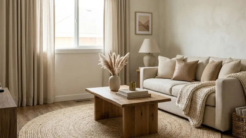
Texture is how expensive rooms create visual interest without using color. A room with a cream linen sofa, a jute rug, a chunky knit throw, and a wooden coffee table has four completely different textures, but they’re all in the same warm neutral family. The result looks layered, rich, and deliberately styled.
Contrast that with a room where every surface is smooth: a microfiber sofa, a flat cotton rug, a glass coffee table, glossy shelving. Even if those individual pieces are high quality, the room reads as flat. Texture is what gives a room depth.
The rule I use: try to have at least four distinct textures in every seating area. Soft (a throw or cushion), woven (a rug or basket), hard/natural (wood or stone), and metallic or reflective (a lamp base, a frame, a tray). Mix those four and you have the foundation of a layered, expensive-looking room.
And the key is to keep the colors tightly controlled while you vary the textures. Let the texture do the work. Color should support it, not compete with it.
Replace Builder-Grade Curtains with Floor-to-Ceiling Drapes
Curtains are one of those details that most people don’t think about consciously but notice immediately. Short curtains, or curtains that don’t quite reach the floor, are one of the clearest markers of a budget room. They cut the wall short visually and make the ceiling feel lower.
Floor-to-ceiling curtains do the opposite. They draw the eye upward and make the ceiling feel higher. In a small living room, this vertical emphasis is one of the most powerful tricks available because it shifts the perceived proportions of the whole room.
The technique that designers use: mount the curtain rod as close to the ceiling as possible, not just above the window frame. Then use curtains that are long enough to just brush or slightly puddle on the floor. This makes the windows look taller and the room look more generous, regardless of the actual window size.
Fabric matters too. Linen, velvet, and silk-look polyester all photograph and read as more expensive than the thin, sheer panels that usually come in budget curtain packs. You don’t need expensive fabric. You need fabric with enough weight and drape to look intentional.
Invest in One Quality Piece and Build Around It
This is the principle that separates a designer’s approach from a beginner’s. In a well-designed small room, there’s almost always one piece that anchors everything else. One thing that’s clearly the best quality item in the room. Everything else serves it.
It doesn’t matter what the piece is. It could be a beautifully crafted coffee table. A ceramic lamp base with an unusual glaze. A single piece of framed art that’s genuinely striking. A sofa in a fabric that’s clearly well-made. The important thing is that there’s one clear anchor piece that sets the quality standard for the room, and everything else is chosen to complement it rather than compete with it.
This approach works on a budget because you’re concentrating your investment in one place. A room with one $300 piece and several carefully chosen $30 pieces will look more cohesive and more expensive than a room where everything cost $75 and nothing stands out.
The Details Nobody Notices But Everyone Feels
This is where the gap between a room that looks expensive and one that looks “nice but off” usually lives. These are the small details that most people don’t consciously register, but that collectively determine whether a room feels polished or slightly unfinished.
Matching Metal Finishes
Walk into an expensive-looking room and look at the metals. The lamp base, the curtain rod, the picture frame, the coffee table legs, the hardware on the shelving. In most well-designed rooms, these are all the same finish: all brushed brass, all matte black, all satin nickel.
In budget rooms, the metals are often mixed without intention. A chrome lamp next to a brass frame next to a black curtain rod. Each one might be fine on its own, but together they create a visual noise that signals a lack of intentional design.
You don’t have to replace everything. Pick one metal finish and use it as your rule going forward. For small living rooms, I find warm metals (brushed brass, aged bronze) tend to make the space feel warmer and more elevated. Matte black is a close second and works particularly well in modern or minimalist spaces.
Intentional Groupings on Shelves and Surfaces
The difference between a shelf that looks styled and one that looks cluttered is almost entirely about grouping. Random objects placed at equal spacing look like a storage problem. Objects grouped deliberately, by height, by color family, or by visual weight, look curated.
The principle designers rely on is odd numbers. It’s called the rule of three, and Real Simple breaks down exactly why it works: our eyes are drawn to asymmetry and gentle variation, which keeps a room feeling comfortable and lived-in rather than staged. In practice, it means grouping objects in threes rather than twos or fours. One tall item, one medium, one low. One item with texture, one smooth, one with some organic shape. Vary the heights so the eye moves up and down across the grouping rather than scanning a flat horizontal line.
The same principle applies to gallery walls. Tightly grouped frames with consistent spacing between them look intentional. Randomly spaced frames at varying distances look like they were hung without a plan.
Fresh Greenery (Real or High-Quality Faux)
A single healthy plant or a small arrangement of real branches does something for a room that no decorative object can replicate. It signals life and care. A room with a thriving plant feels tended-to in a way that an empty room doesn’t, regardless of how nice the furniture is.
If you’re not able to keep plants alive (I’ve been there), the threshold for high-quality faux greenery has genuinely improved in recent years. The key is to look for plants with realistic imperfection: slightly varied leaf sizes, natural variation in color, stems that look like they actually grew. Perfectly uniform faux plants look plastic immediately. Slightly imperfect ones can pass.
One or two plants, not six. In a small room, a forest of plants becomes visual noise. One large floor plant in a corner or two small plants at different heights on a shelf is enough to add life without tipping into crowded.
Freshly Laundered Soft Furnishings
This sounds obvious, but it’s remarkable how much a clean, well-fluffed sofa cushion changes the impression of a room. Flat, wrinkled, or stained soft furnishings signal neglect more than any other single detail.
If your current sofa cushions are looking tired, try washing the covers (if removable), refluffing the inserts, or adding a new set of throw cushions in a fabric that photographs better. New cushion covers cost very little and completely change the visual freshness of a sofa.
The same applies to throws. A throw that’s artfully draped over a sofa arm reads as intentional styling. A throw that’s been bunched up and left suggests the sofa is a crash pad, not a designed space.
Layout Moves That Signal Professional Design
Even with the right furniture and the right details, a poorly arranged room will never look expensive. Layout is the skeleton of the design. Everything else sits on top of it.
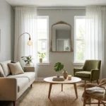
Float the Furniture Away from the Walls
The most common layout mistake in small living rooms is pushing all the furniture against the walls in an attempt to create more space in the center. The result is the opposite of what people hope for: the room looks like the furniture is hugging the perimeter for safety, and the center feels empty and awkward.
Pulling the sofa and chairs a few inches, or even a foot, away from the wall creates a seating grouping that looks intentional and contained. The conversation area has its own presence. The room looks like it was arranged rather than just placed.
Yes, this takes up more floor space in theory. But it almost always makes the room look larger in practice because it creates visual layers: the wall plane, then a gap of air, then the furniture. That layering is a hallmark of professionally designed spaces.
Create a Clear Focal Point
Expensive-looking rooms always have a focal point: one element that the room is arranged around. It could be a fireplace, a large piece of art, a TV wall with a thoughtful treatment around it, or even a large window. Everything in the room relates back to that focal point.
In a small living room without a natural focal point, you have to create one. The most effective way is with art or a mirror. A large piece of art or a well-chosen mirror hung at the right height on the main wall instantly gives the room a center of gravity. The sofa faces it. The chairs angle toward it. The room has a reason for its arrangement.
Mirrors specifically are worth highlighting because they do double duty: they create a focal point and they expand the perceived space by reflecting light and depth. The full guide on using mirrors to make a small living room look bigger covers placement and sizing in detail, but the general rule is to hang a mirror where it will reflect the most light or the most visually interesting part of the room.
Define the Space with a Proper Rug
A rug that’s too small for the seating arrangement makes a room look unfinished and budget regardless of everything else in it. It’s the visual equivalent of wearing a well-tailored suit with the wrong shoes.
In a small living room, the rug should anchor the entire seating area, with at least the front legs of all seating pieces resting on it. This creates a defined zone that signals intentional design. When the furniture is floating off the rug, nothing feels connected and the room looks accidental rather than planned.
If budget is a constraint, this is one of the places worth stretching it. A larger, better-quality rug with real texture will do more for the overall look of the room than almost any other single piece.
What Accidentally Makes a Room Look Cheap
Sometimes the issue isn’t what’s missing. It’s what’s there that shouldn’t be.
Too Many Small Decorative Objects
A shelf full of small trinkets, a coffee table covered in little objects, a collection of small frames at eye level: individually each piece might be perfectly nice. Together they create visual busyness that reads as cluttered and cheap, not curated and collected.
The edit here is hard because people are often emotionally attached to these objects. But the discipline to keep only the things that genuinely contribute to the room, and to store or relocate the rest, is one of the most important skills in making a space look expensive. Restraint is a design principle, not a sacrifice.
Visible Technology Clutter
Cables, power strips, routers, and tangled chargers visible in a living room are the design equivalent of a wrinkled shirt. They signal a room that functions but hasn’t been finished. Cable management doesn’t require expensive solutions. A few cable ties, a small basket to hide a power strip, and a habit of tucking cords behind furniture are enough to make a significant visual difference.
Matching Sets
A perfectly matching furniture set, where the sofa, loveseat, and chair all came from the same collection, almost always looks less expensive than a thoughtfully mixed room. Matching sets read as showroom displays or hotel lobbies rather than curated personal spaces.
The more expensive approach is to mix pieces with different silhouettes, different textures, and different origins, like one vintage find, one retailer purchase, one inherited piece, that share a common design language (color family, leg style, scale). That mix is what creates the impression that a room was collected over time, which is exactly what genuinely expensive rooms look like.
The Room-by-Room Expensive Edit: A Practical Checklist
Use this as a practical action plan. You don’t have to do everything at once. Start with whichever item has the highest impact for your current room.
Lighting:
- Add at least one floor lamp or table lamp to move away from overhead-only lighting
- Install a dimmer switch on your overhead light if possible
- Choose lamp bases with solid, heavy materials (ceramic, stone, brass)
Textiles:
- Add a throw in a natural fiber (wool, cotton, linen) draped over one sofa arm
- Swap thin, synthetic cushion covers for linen or boucle
- Make sure the rug is large enough to anchor the seating area
Color and Cohesion:
- Identify your three-color palette and remove anything that doesn’t fit
- Unify your metal finishes across the room
- Keep the wall color, largest furniture piece, and rug in the same temperature (warm or cool)
Layout:
- Pull the sofa at least 6 inches from the wall
- Create a clear focal point with art or a mirror
- Clear the floor of everything that doesn’t need to be there
Details:
- Style shelves in intentional groupings of three
- Add one plant or high-quality faux greenery
- Remove or store decorative objects that don’t contribute to the palette
If your living room is a rental and you’re working around limitations, the guide on how to decorate a small living room without clutter covers how to create an expensive-feeling space within the constraints of a rental, including what you can change and what you can work around.
Pro Perspective: What Designers Actually Prioritize
When professional interior designers work on a small budget, there’s a consistent pattern in where they spend and where they save.
They spend on: Lighting, the sofa, and the rug. These three elements define the feel of a living room more than anything else. Getting them right justifies significant investment.
They save on: Throw pillows, decorative objects, side tables, and art. These are the elements that are easy to swap out as your taste evolves and easy to find at great quality for low cost if you’re patient.
They never compromise on: Scale and proportion. A cheap lamp at the right scale looks better than an expensive one at the wrong scale. Scale is free. It only costs attention.
Their most common free fix: Editing. Every designer, when walking into a room that doesn’t feel right, starts by removing things rather than adding them. If your room feels off and you’re not sure why, try taking out every decorative object and adding them back one at a time. You’ll usually find the room looked best with half of what you started with.
The couch color choices that read as expensive are worth knowing too, especially when you’re deciding whether to reupholster, slipcover, or replace your current sofa. The guide on best couch colors for small living rooms breaks down which tones photograph well, which age gracefully, and which tend to cheapen a room over time.
The Bottom Line: How to Make a Small Living Room Look Expensive
Making a small living room look expensive isn’t about spending more. It’s about spending smarter and editing harder.
The biggest shifts come from the things most people overlook: lighting quality over quantity, texture layering within a tight color palette, furniture pulled away from the walls to create intentional groupings, and a disciplined approach to what gets to stay in the room at all.
Start with one thing this week. Fix the lighting. Clear the floor. Swap the cushion covers. Add a throw with real texture. Each small change compounds, and within a few weekends of deliberate editing, the room will feel like a different space.
You don’t need a designer’s budget. You need a designer’s eye. And that’s something you can develop.
Pingback: Best Coffee Table Shapes for Small Living Rooms