Paint is the cheapest renovation you can do to a small living room . Somehow it’s still the one people get most wrong.
I’ve painted at least seven rooms in my life, and three of them were small living rooms in apartments where the walls felt like they were slowly closing in. I made every mistake: I picked a color I loved on the paint chip only to find it turned green on my walls. I went too dark thinking it would feel cozy and ended up with something that felt like a cave. And I once painted an entire room a very trendy shade of gray that photographed beautifully and looked absolutely dead in person.
What I’ve learned through all of that is this: choosing the best wall colors for small living rooms isn’t really about following a list of “approved” colors. It’s about understanding why certain shades work and others don’t. That understanding is what lets you make a smart decision for your specific room, your specific light, your specific furniture. That’s what this guide is going to give you.
We’re going to cover the colors that genuinely open up a small space, the ones that look great on Pinterest but backfire in real rooms, the tricks designers use with paint that most people never think to try, and the specific undertone mistakes that send a perfectly good color sideways. By the end, you’ll know exactly what to look for and what to walk away from.
Why Wall Color Has Such a Huge Impact in Small Living Rooms
Before we get into specific colors, it’s worth understanding what’s actually happening when a paint color makes a room feel bigger or smaller. Because once you get this, the rest of the guide clicks into place.
Light Reflectance Value: The Number Nobody Talks About
Every paint color has something called a Light Reflectance Value, or LRV. It’s a number between 0 and 100 that tells you how much light the paint reflects. Pure black is 0. Pure white is 100. Most wall paints land somewhere in the 30s through 80s.
In a small living room, LRV matters more than the actual color. A pale sage green with an LRV of 72 will open up a room more than a medium beige with an LRV of 45 , even though the beige sounds more neutral. When you’re at a paint store and you’re stuck between two options, ask the associate for the LRV. Or look it up on the paint brand’s website. Anything above 65 will feel genuinely light and airy on the wall. Below 50 starts to absorb light and compress the space.
How Small Rooms Amplify Color
Here’s something that surprises most people: color looks significantly more saturated and intense on a wall than it does on a paint chip. A color chip is maybe 2 inches by 3 inches. Your wall is 9 feet tall and 14 feet wide. That’s an enormous surface area, and every square inch is reflecting that color back into the room.
This is why small rooms in particular get overpowered by colors that look perfect on the chip. A soft dusty blue that reads almost white on the sample card can read as a full-on medium blue once it’s covering four walls. You have to account for this. Always go one shade lighter than your instinct tells you.
The Light Direction Problem
North-facing rooms get cool, indirect light all day. South-facing rooms get warm, direct light. East-facing rooms are bright in the morning and dim in the afternoon. West-facing rooms are the opposite.
This matters enormously because paint colors have undertones: hidden hues that only reveal themselves under certain lighting conditions. A paint that looks like a clean warm white in a south-facing showroom can reveal a distinctly purple or blue undertone in your north-facing living room. This is the single most common reason people repaint rooms within six months of finishing them.
Before you commit to any color, buy a sample pot and paint a 12-by-12-inch swatch on two different walls. Live with it for two to three days, checking it in the morning, at noon, in the afternoon, and in the evening with the lights on. That’s the only way to actually know what a color will do in your room.
If you’re decorating a rental and repainting isn’t an option, the same principle applies to all your soft furnishings. Throw pillows, curtains, and rugs will all interact with whatever wall color is already there. The guide on living room color ideas for rental apartments covers how to work with white or off-white rental walls to still get a space that feels intentional and put-together.
The Best Wall Colors for Small Living Rooms
These are the colors that consistently perform in small spaces — not just in design magazines but in real apartments and homes with average light, average proportions, and average furniture.
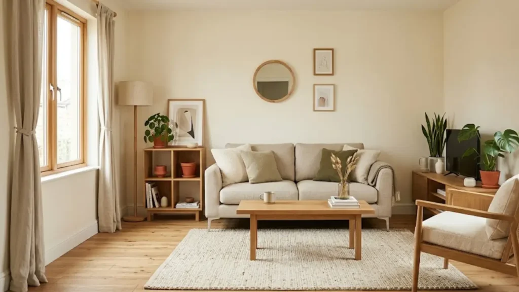
Warm White: The One That Actually Works
Not pure white. Not stark, hospital white. Warm white.
Pure white (think Benjamin Moore Chantilly Lace, Sherwin-Williams Extra White) looks stunning in showrooms and in spaces with abundant natural light, tall ceilings, and very intentional modern furniture. In a small living room with standard 8-foot ceilings and mixed furniture? It reads cold, flat, and weirdly small. The walls seem to close in instead of expand outward.
Warm whites are different. They have a slight hint of cream, yellow, or blush that makes them feel alive under natural and artificial light. Some that consistently work in small rooms:
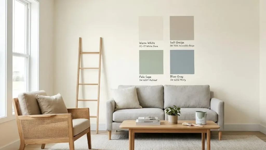
Benjamin Moore White Dove (OC-17) is one of the most reliably beautiful warm whites available. It has a very subtle yellow-green undertone that disappears under most lighting and leaves the room feeling clean, soft, and genuinely airy. LRV is 85.4, which is extremely high, which means it bounces light around the room exceptionally well.
Sherwin-Williams Alabaster (SW 7008) leans slightly creamier than White Dove. It’s warm without being yellow, which makes it particularly good in rooms that get afternoon light. LRV is 82, still very high.
Benjamin Moore Simply White (OC-17) is perhaps the single most popular warm white of the last decade. It’s clean enough to feel fresh but warm enough to feel inviting. Works in almost every light condition, which makes it the safest choice when you’re not sure.
Warm whites work because they reflect maximum light while still adding warmth. They make the room feel spacious and lived-in at the same time, which is a surprisingly hard balance to find.
Soft Greige: The Neutral That Does Everything
Greige is the portmanteau of gray and beige, and it became popular for a reason: it takes the warmth of beige and the sophistication of gray and blends them into something that looks intentional without being boring.
In small living rooms, greige works particularly well because it doesn’t compete with furniture. It recedes visually, making whatever you put in front of it. A colored sofa, a patterned rug, wood tones all feel more present and deliberate.
Sherwin-Williams Accessible Beige (SW 7036) is probably the most recommended greige in interior design circles. It has warm beige undertones with just enough gray to keep it from looking dated. In a small room with warm light, it glows. LRV of 58 puts it in the mid-range. It’s not a light bouncer like warm white, but it adds so much warmth and life that most rooms don’t feel compressed.
Benjamin Moore Revere Pewter (HC-172) was the greige of the 2010s and it still holds up. It’s slightly darker than Accessible Beige, with more gray in its composition. In rooms with good natural light, it feels sophisticated and modern. In darker rooms, it can veer toward dingy, so always test first.
For furniture-heavy small rooms where the sofa and chairs are the visual stars, greige is often the smarter choice over warm white because it provides contrast without competing.
Soft Blue-Gray: The Airy, Sophisticated Choice
If you want a small living room that feels calm, collected, and larger than it is, soft blue-gray is one of the most reliable choices in the designer playbook.
The key word is soft. We’re not talking about a medium blue or a true gray. We’re talking about a color that sits somewhere between the two. It’s pale enough to read as almost neutral, but with just enough blue in it to make the walls feel like they’re receding.
Sherwin-Williams Misty (SW 6232) is a perfect example. It’s a soft, dusty blue-gray that shifts slightly in different lights, cooler in the morning and warmer in the afternoon. On large walls, it reads as an airy near-neutral that makes rooms feel calmer and more spacious. LRV is 67, well into the light-and-airy range.
Benjamin Moore Pale Oak (OC-20) technically straddles the line between greige and blue-gray depending on the light, which is exactly what makes it so versatile. In north-facing rooms it leans cool and airy; in south-facing rooms it picks up warmth. It’s one of the most forgiving small-room colors available.
This category pairs especially well with light wood furniture, white trim, and natural textures — a linen sofa, a jute rug, open shelving in pale oak. If that’s the aesthetic you’re going for, soft blue-gray walls will be the thing that ties it all together.
Because blue-gray pairs so well with light furniture tones, it’s worth thinking about your sofa color before you commit. The guide on best couch colors for small living rooms is useful here, especially if you’re deciding between a light neutral sofa and something with more color.
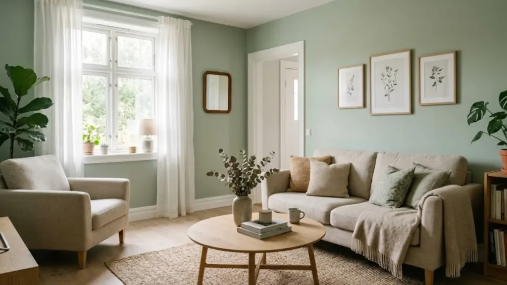
Pale Sage Green: The Trend That’s Actually Worth It
Sage green has been everywhere for a few years now, and I’ll be honest: I was skeptical. Trendy colors in home decor age fast, and I didn’t want to paint a room in a color that would feel dated in three years.
But the more rooms I’ve seen done in pale sage green, the more I’ve come around. When it’s done right, it’s one of the most sophisticated, genuinely calming choices for a small living room.
The reason pale sage works in small spaces is the same reason all these muted, soft colors work: it has a high LRV, it doesn’t compete with the furniture, and it adds enough interest to keep the room from feeling flat. But sage has something the others don’t: it connects the room to organic, natural tones in a way that makes the space feel intentional and warm without being beige.
Clare Color Wanderer and Sherwin-Williams Retreat (SW 6207) are two of the best execution shades. Both are pale enough to read as almost neutral in strong light, but clearly sage in softer light. They work beautifully against warm whites and natural wood tones.
What doesn’t work: medium sage or olive-toned sage in rooms with limited light. These darker versions absorb light and can make a small room feel oppressively green. Stay in the pale, slightly grayed range.
Colors That Look Good in Theory But Shrink Small Rooms
This section might save you from a very expensive mistake.
All-White (Stark, Cool White)
I know. Every design article says white makes rooms look bigger. And in a certain type of room — good light, high ceilings, and very intentional minimalist furniture, it does. But in a typical small apartment living room with 8-foot ceilings, average natural light, and a mix of furniture? Stark white walls tend to highlight the corners, show every scuff and mark, and create a harshness that makes the room feel clinical rather than spacious.
This is the counterintuitive truth about white: it doesn’t automatically open up a room. Warm white does. Stark white often just makes the room feel like a very small white box.
Medium Gray
Gray became the dominant neutral of the 2010s, and for a few years it felt like every home on Instagram was painted some version of it. In small rooms, medium gray is almost always a mistake. It absorbs too much light, has too much visual weight, and tends to make a small room feel gloomy and heavy, especially in the afternoon and evening when natural light fades.
If you love gray, go very pale. A gray with an LRV above 70 can work. Anything below that, especially in north-facing or smaller rooms, will feel more oppressive than sophisticated.
Deep, Saturated Colors (Including “Moody” Trends)
There’s a whole aesthetic online right now around moody, dark living rooms: deep forest green, ink blue, charcoal, dark burgundy. In the right space (large rooms with tall ceilings, strong architectural details, abundant natural light), these colors look stunning. In a small living room, they do the opposite.
I’m not saying never. But “dark and dramatic” works in spaces that have room to absorb the drama. Small rooms don’t have that luxury. Deep colors in small spaces will make the room feel like a very expensive walk-in closet. If you’re drawn to bold color, consider an accent wall instead of all four walls.
Paint Tricks That Make Small Rooms Feel Bigger
Beyond choosing the right color, there are a few techniques that designers use to stretch a small room visually, and most of them involve paint.
Paint the Ceiling the Same Color as the Walls
This sounds wrong. Conventionally, ceilings are white. The reason is that white ceilings reflect light and recede visually. But in a small room, the contrast between colored walls and a white ceiling creates a visual “lid” that actually emphasizes how low and close the ceiling is.
When you paint the ceiling the same color as the walls — or one to two shades lighter, the boundary between the wall and ceiling blurs. Your eye doesn’t register the corner; it keeps traveling upward. The room feels taller, and the ceiling feels higher than it is. This is one of the most effective small-room tricks I’ve actually used, and the difference is genuinely surprising.
Use Satin or Eggshell Finish (Not Flat)
Paint finish matters more than most people realize. Flat or matte paint absorbs light, which is beautiful for photography but counterproductive in small rooms. Eggshell and satin finishes have a subtle sheen that reflects light back into the room, which makes the walls feel more alive and the space feel slightly larger.
The practical bonus: eggshell and satin are also much easier to clean. In a small living room where walls are close to foot traffic and furniture, the ability to wipe down a smudge without repainting a section is worth a lot.
Keep the Trim Slightly Lighter Than the Walls
This is a subtle designer trick that not many people try. Conventionally, trim is pure white regardless of wall color. But when you choose trim that’s one shade lighter than the wall color (rather than stark white), the room feels more cohesive — the color flows rather than stopping abruptly at every door frame. That’s particularly effective with greige and soft blue-gray palettes.
Extend the Wall Color Onto Shelving and Built-ins
If you have built-in shelving, bookcases, or any architectural element in your small living room, painting it the same color as the walls makes it visually recede. Instead of dark, heavy furniture interrupting the wall plane, the shelving blends in and the eye travels across the whole wall as a single surface. The room feels more open and less cluttered.
This also applies to radiators and other fixed elements you can’t remove. Paint them to match the wall and they disappear.
Using mirrors is another powerful visual trick that works alongside paint to expand a small room. If you haven’t already, the guide on how to use mirrors to make a small living room look bigger pairs beautifully with what paint does for light and space.
How to Choose the Right Color for Your Specific Room
All of the above is general. Here’s how to make it specific to your room.
Step 1: Identify Your Light Direction
Stand in the room at midday without any lights on. Which wall gets the most direct sunlight? That tells you your primary light source.
North-facing rooms: go warm. Warm white, greige, or a pale sage with warm undertones. Cool grays and blue-whites will look flat and slightly purple in north light.
South-facing rooms: you have the most flexibility. Warm whites look their absolute best in south light. You can also pull off slightly deeper shades that might feel heavy in other orientations.
East and west-facing rooms: pay attention to time of day. East rooms are bright in the morning and dim in the afternoon. West rooms are the reverse. Choose a color that works in both conditions — greige and warm white tend to be most forgiving here.
Step 2: Pull the Undertones from Your Furniture
Your sofa, flooring, and largest furniture pieces all have undertones too. A beige sofa usually has either a pink-purple undertone or a yellow-green one. Light wood floors can read as orange-warm or as cool/gray depending on the species and finish.
The goal is harmony, not matching. Pull a secondary color from your floor or sofa undertones and look for a wall color that sits in the same temperature range. Warm + warm feels cohesive. Warm + cool creates subtle tension that can feel intentional, though it requires more care.
Step 3: Buy Samples Before You Commit
This is not optional. A quart of sample paint costs around $5–8 and will save you from a decision you’ll regret for the next two years. Paint 12-by-12-inch swatches on at least two different walls. Check them at different times of day. Take photos in both natural and artificial light.
If you’re working in a rental and can’t paint samples directly on the wall, paint the samples on a large piece of foam board or card stock and prop it up against the wall instead. It’s not perfect, but it’s far better than committing without testing.
If your living room connects to a dining area or entryway, you need to think about color flow across spaces too. The full guide on how to make a rental apartment feel like home addresses this specifically, including how to create visual consistency across an open-plan layout without everything feeling beige and same.
Common Wall Color Mistakes in Small Living Rooms
Choosing Based on Artificial Light Only
Paint stores have bright, warm artificial lighting that makes almost every color look flattering. Your living room at 6pm on a cloudy Tuesday does not. Always view the sample in your actual room before committing.
Going Too Trendy Without Considering Longevity
Very saturated, very trend-specific colors, like last year’s clay pink, this year’s terracotta, or next year’s whatever-comes-next, tend to feel dated faster in small rooms because the walls are so prominent. If you love a trendy color, use it in accent pieces (cushions, a single chair, a throw) where it’s easy to swap out. Keep the walls in the timeless range.
Ignoring the Floor Color
Light gray walls on dark brown floors create a jarring contrast that makes the room feel choppy and smaller. Before you choose a wall color, lay your paint sample on the floor next to the existing flooring. The transition should feel natural, not jarring.
Using Different Whites on Walls and Trim
If your trim is already a specific white from a previous paint job, test your new wall color next to that trim before you paint. Two different whites next to each other don’t look like “white and white.” They look like one is dirty. Either repaint the trim to match or choose a wall color that was designed to pair with the trim white you already have.
Skipping the Primer
In a small room, especially if you’re going from a dark or saturated color to a light one, skipping primer almost always results in needing three coats instead of two. The extra time spent on primer saves time and money overall. And in a small room where the walls are close to everything, coverage quality is very noticeable.
A Quick Reference Guide by Room Type
Sometimes the fastest answer is the most useful one. Here’s a quick guide for specific small living room situations:
Rental with white walls you can’t paint: Use your furnishings to add warmth. A warm-toned rug, cream curtains, and wood-toned furniture will make the white walls feel intentional. Detailed tips in the small apartment living room ideas guide.
Low natural light: Warm white or pale greige. Avoid anything cool-toned. Blues, grays, and cool greens will feel dark and flat. Maximize every light source you have.
Already-cluttered feeling room: Don’t try to solve clutter with paint color. Paint can help, but the foundational issue is organization and furniture selection. The guide on how to decorate a small living room without clutter addresses this directly.
Open-plan living-dining-kitchen: Keep the wall color consistent across the whole space. Changing colors between zones visually divides the room and makes every section feel smaller. One color, ideally warm white or greige, flows the space together and makes the whole area feel more generous.
Room with a brown sofa: Brown sofas work best with warm wall colors that complement their undertones rather than contrast them. The guide on decorating a living room with a brown sofa has specific color pairing ideas.
The Bottom Line on Wall Colors for Small Living Rooms
The color itself matters less than you think. The undertone, the LRV, and how the color interacts with your specific light and your specific furniture: those are what matter.
Start with warm white if you’re unsure. It’s the most forgiving, the most universally flattering, and the easiest to build a room around. From there, greige gives you warmth and sophistication, soft blue-gray gives you calm and airiness, and pale sage gives you personality without trend risk.
Whatever you choose: buy the sample first, live with it for a few days, check it morning and night, and don’t commit until you’re genuinely confident. The cost of a sample pot is nothing compared to the cost of repainting a room you got wrong.
Your walls set the tone for everything else in the room. Get them right, and the rest of the decorating gets easier.


Pingback: How to Make a Small Kitchen Look Bigger: 14 Real Tricks